Modern Downtown, San Jose
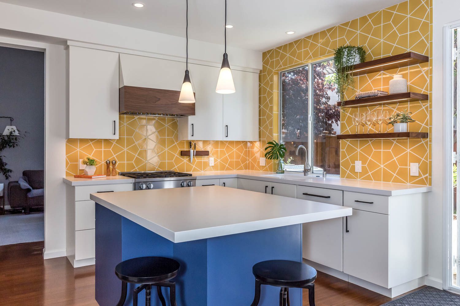
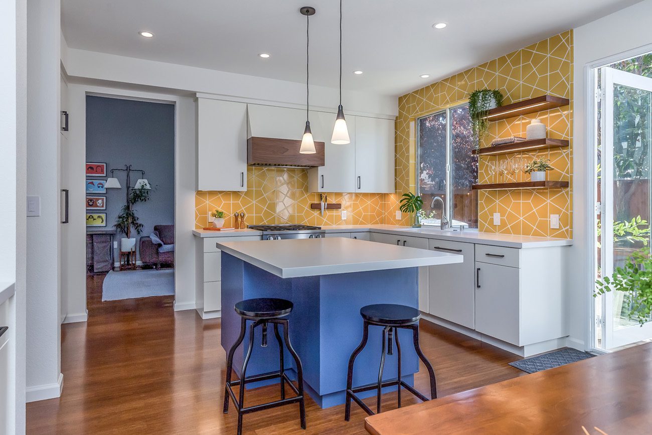
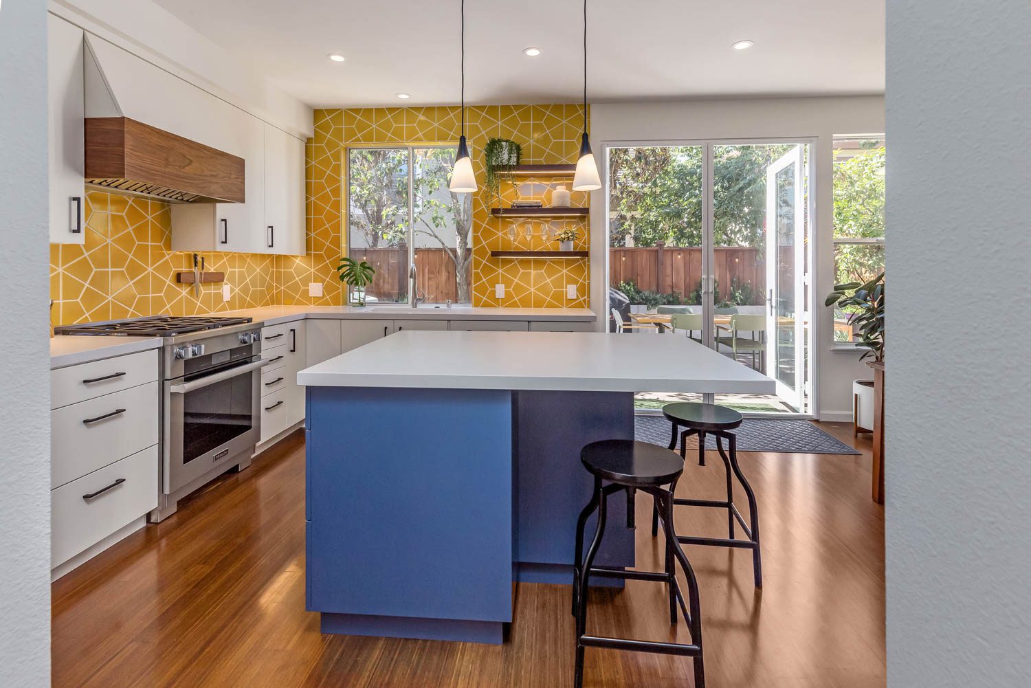
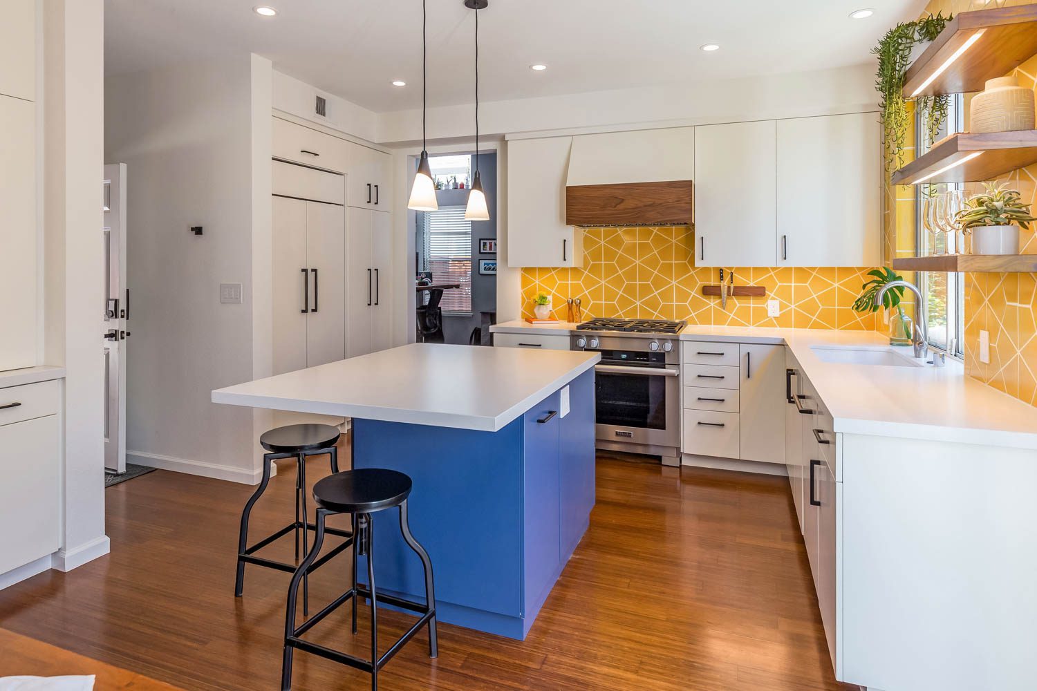
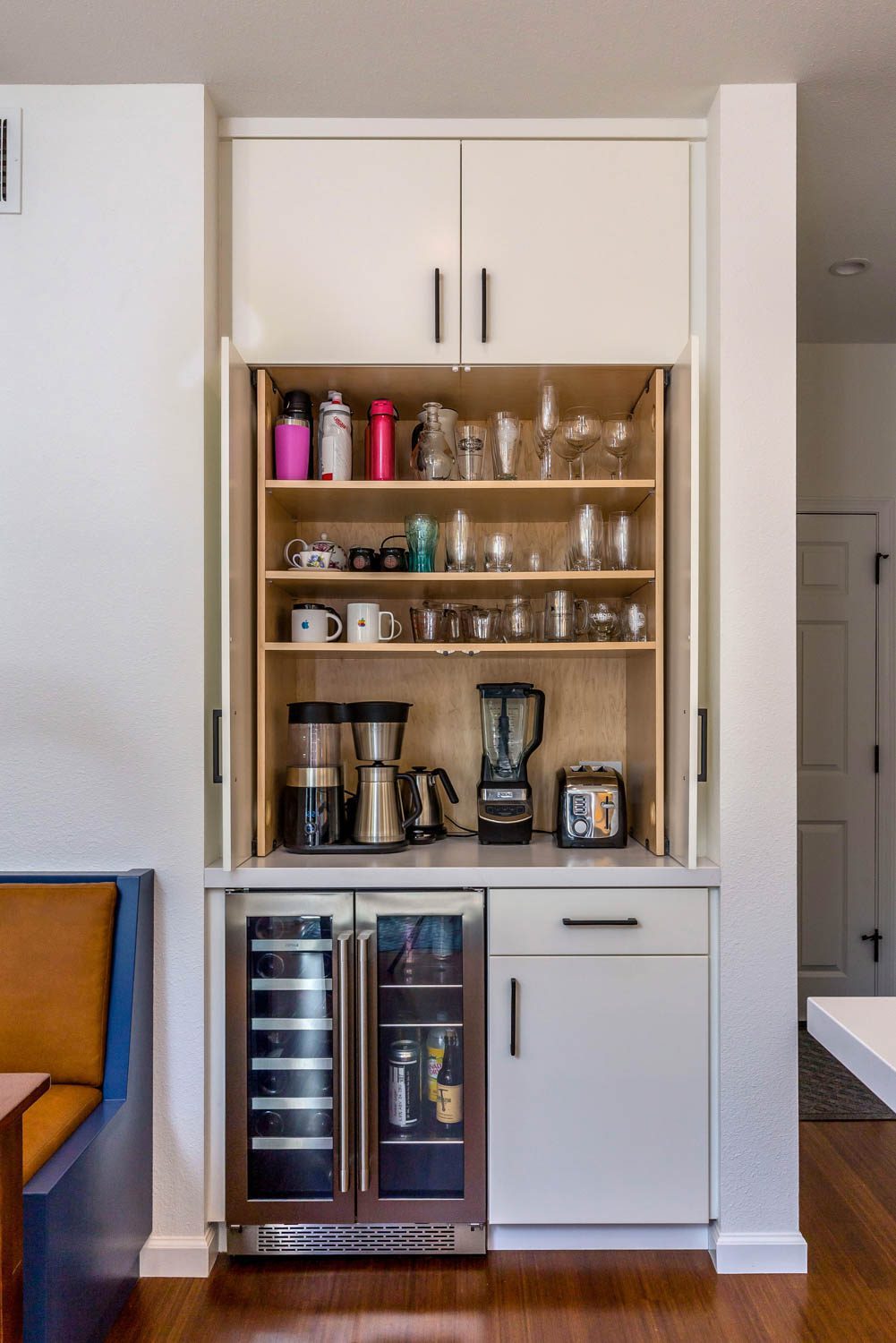
Our newly-wed clients recently moved to the Bay Area from Kentucky, ready to build their new lives in the Silicon Valley. The couple completed many home improvement projects on their own, but when it came to their kitchen, they knew they wanted professional guidance. They liked bold colors, they loved to cook, and were particular when it came to the kitchen layout and where their items would be stored. From the start of the remodel, we nicknamed the space the “happy kitchen”, and the final result was true to its name!
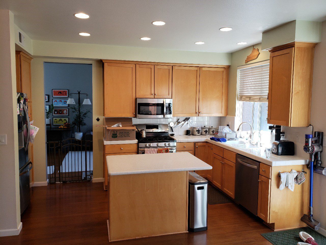
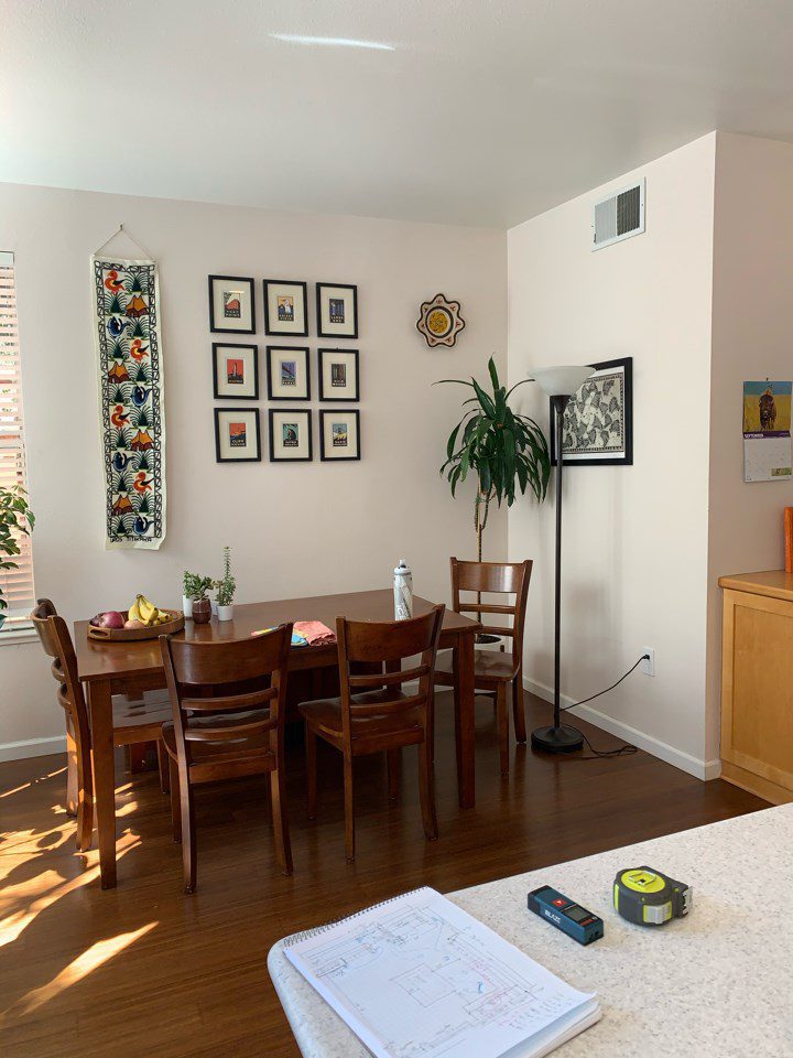
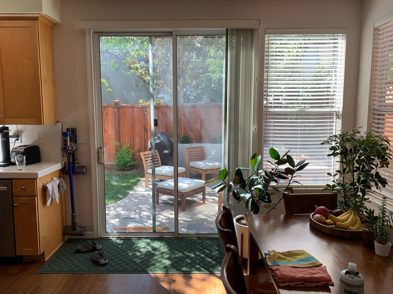
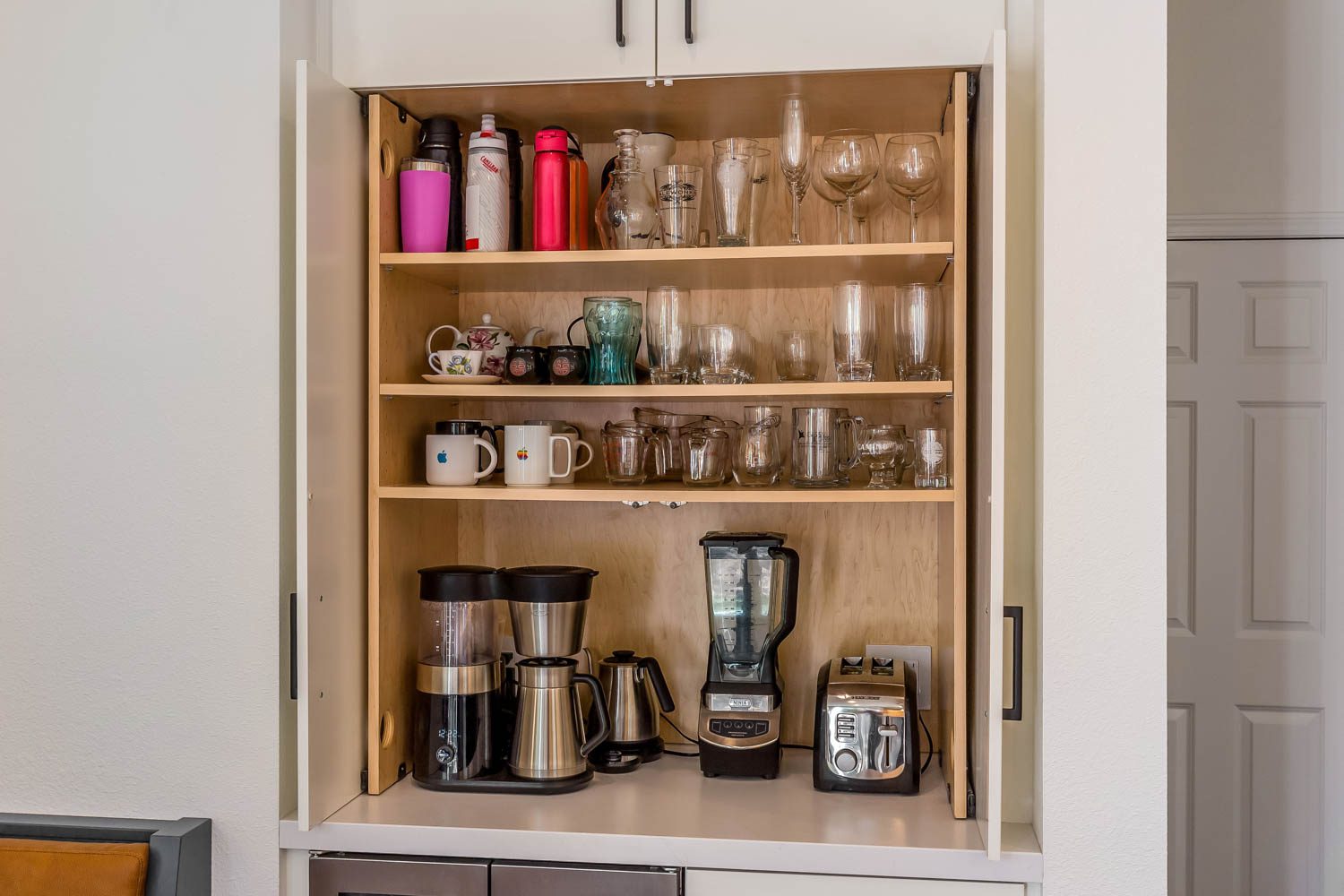
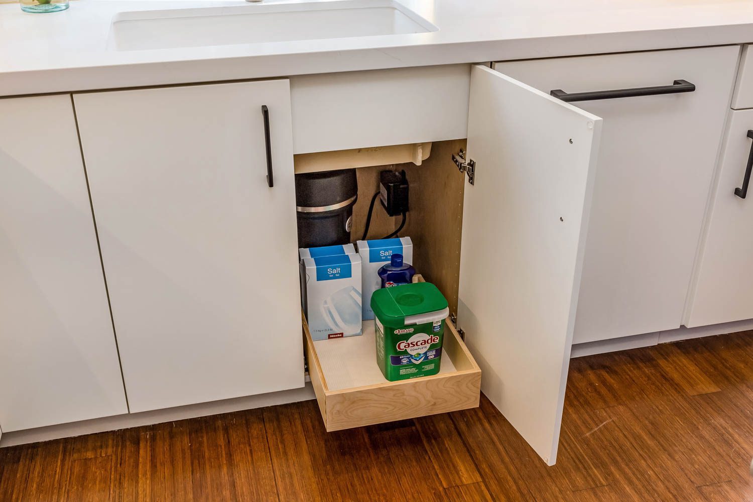
The clients wanted a bold design in their kitchen to make the space pop. The current space was underwhelming and lacked important storage space. While the kitchen may feel small, there was an abundance of unused space that made the room feel cold and unfunctional. The recessed lighting was the only lighting in the space and the ceilings were very high. The client’s desired layers of light that would create a cheery ambiance. The clients also did not like the exposed trash can, the microwave squeezed in tightly above the stove, and the lack of any decorative focal points.
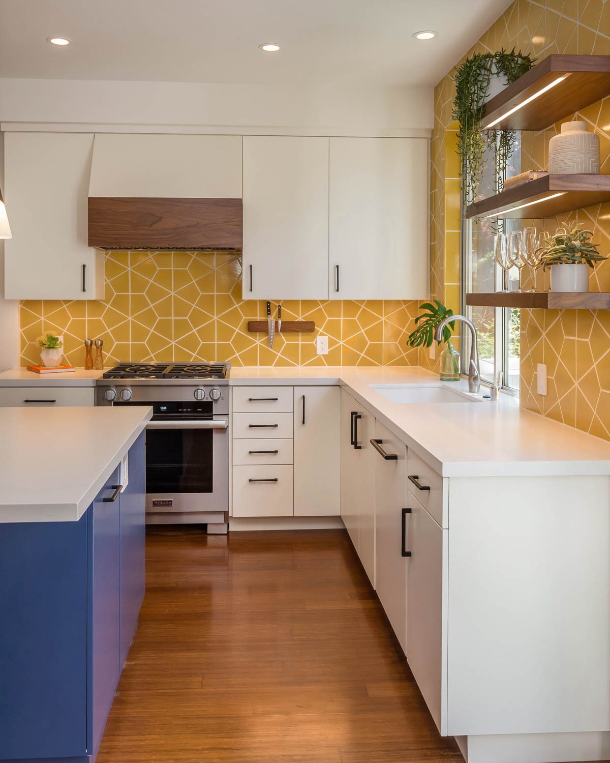
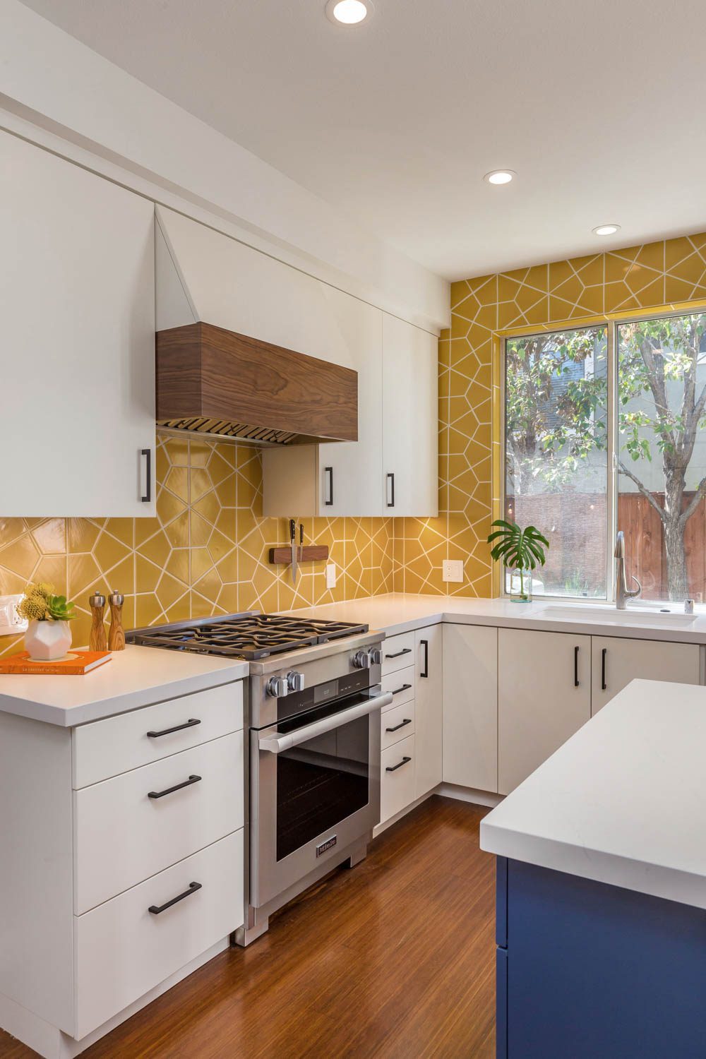
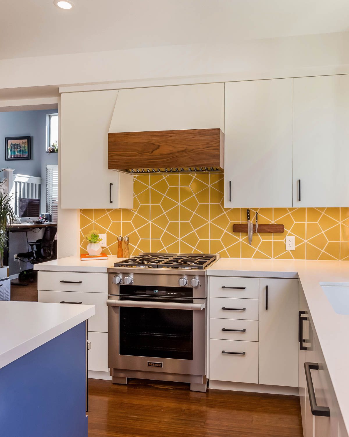
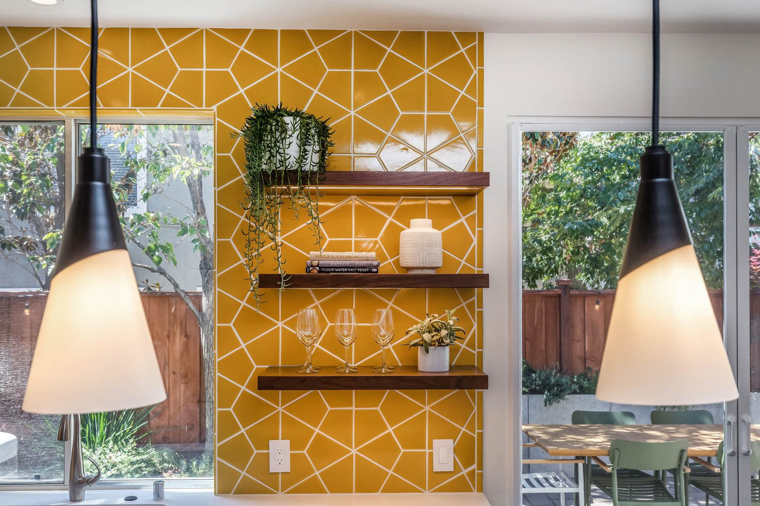
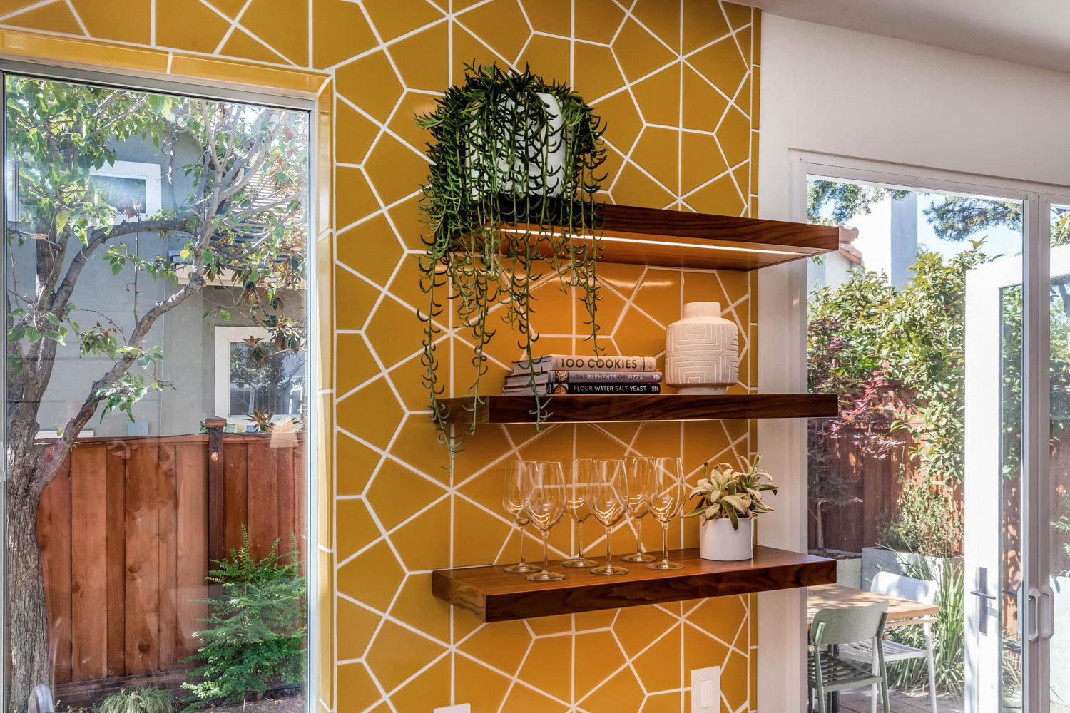
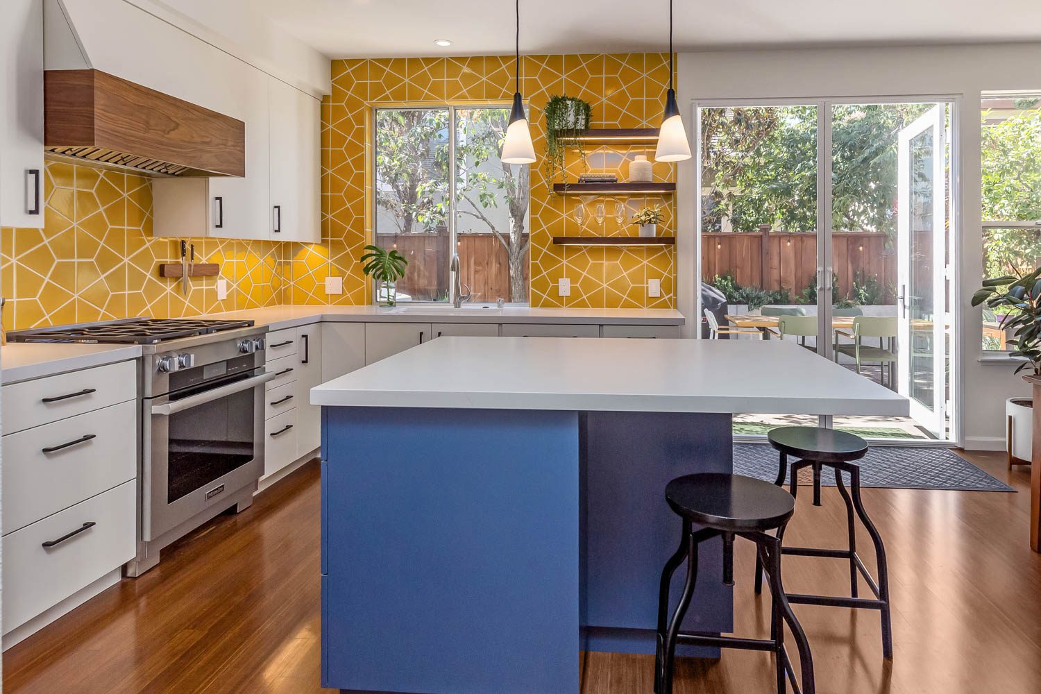
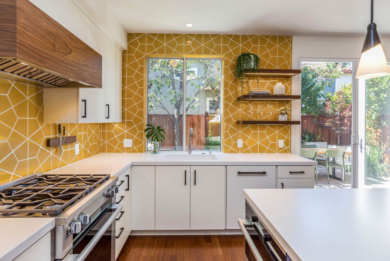
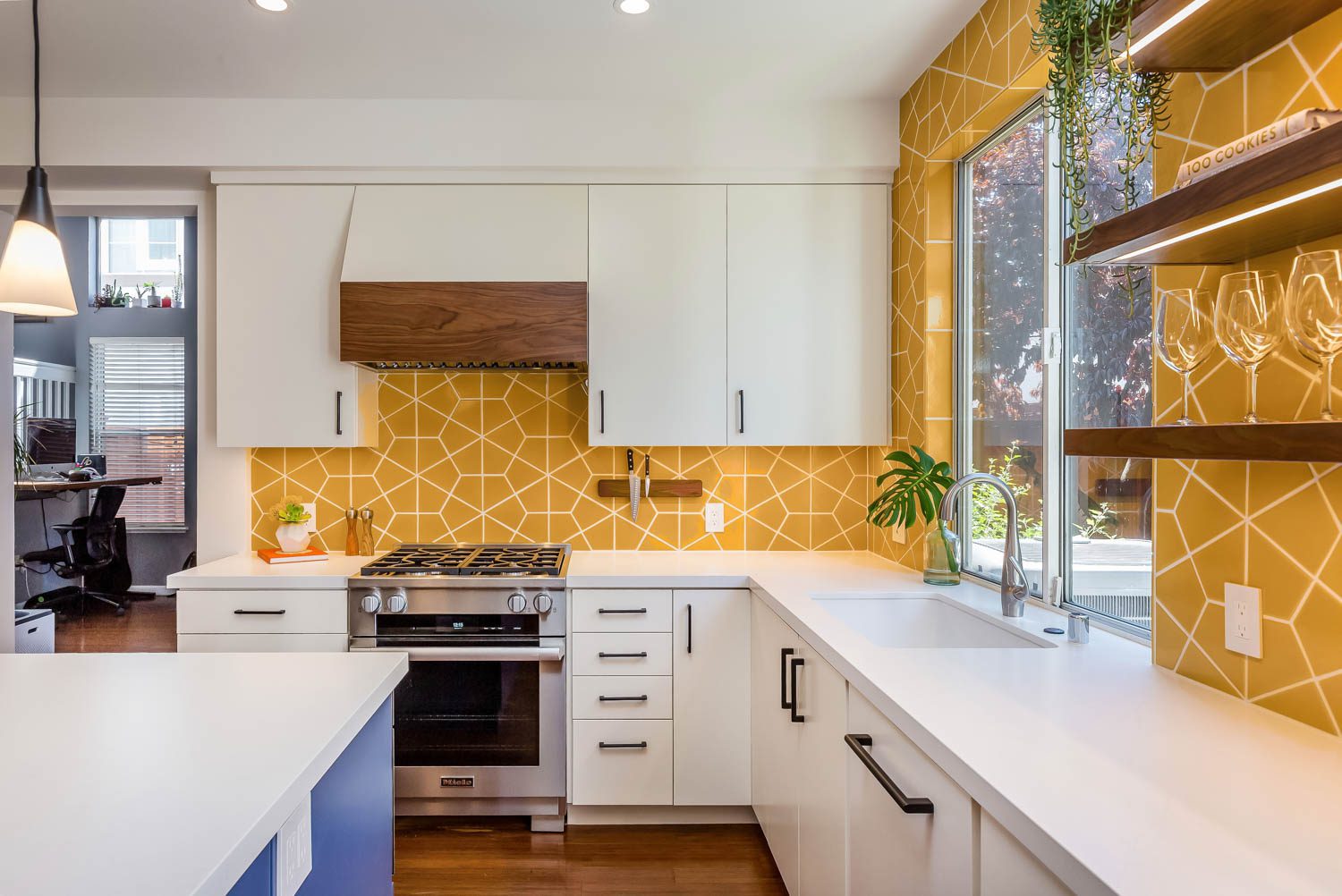
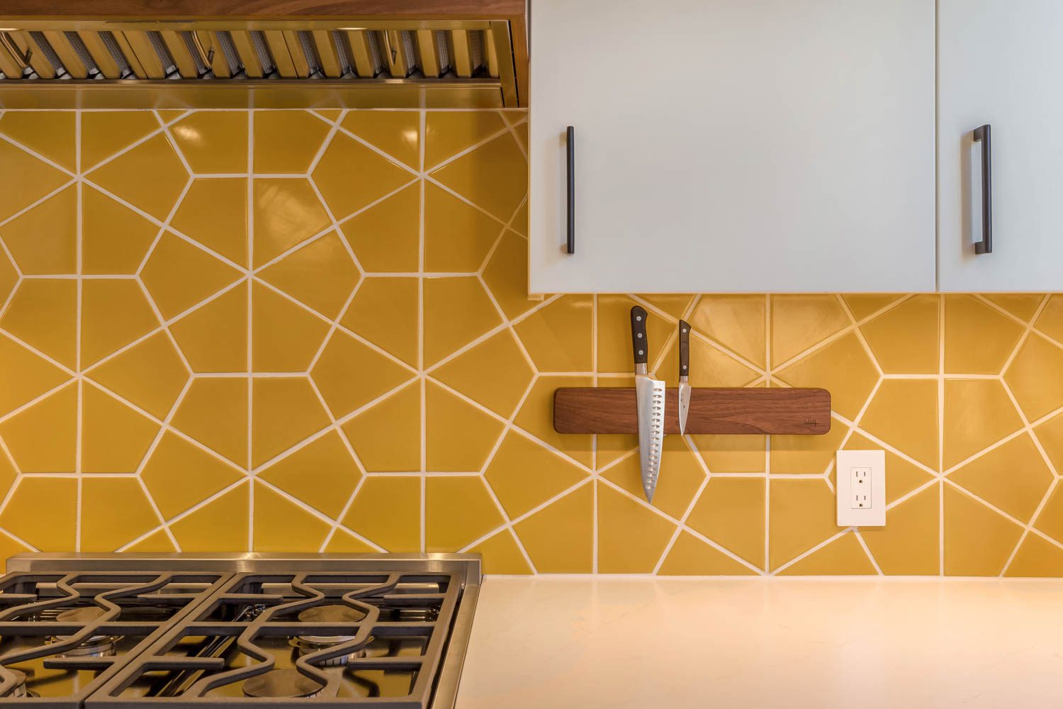
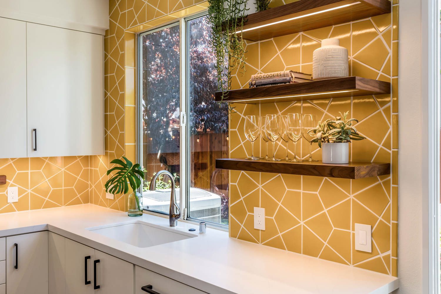
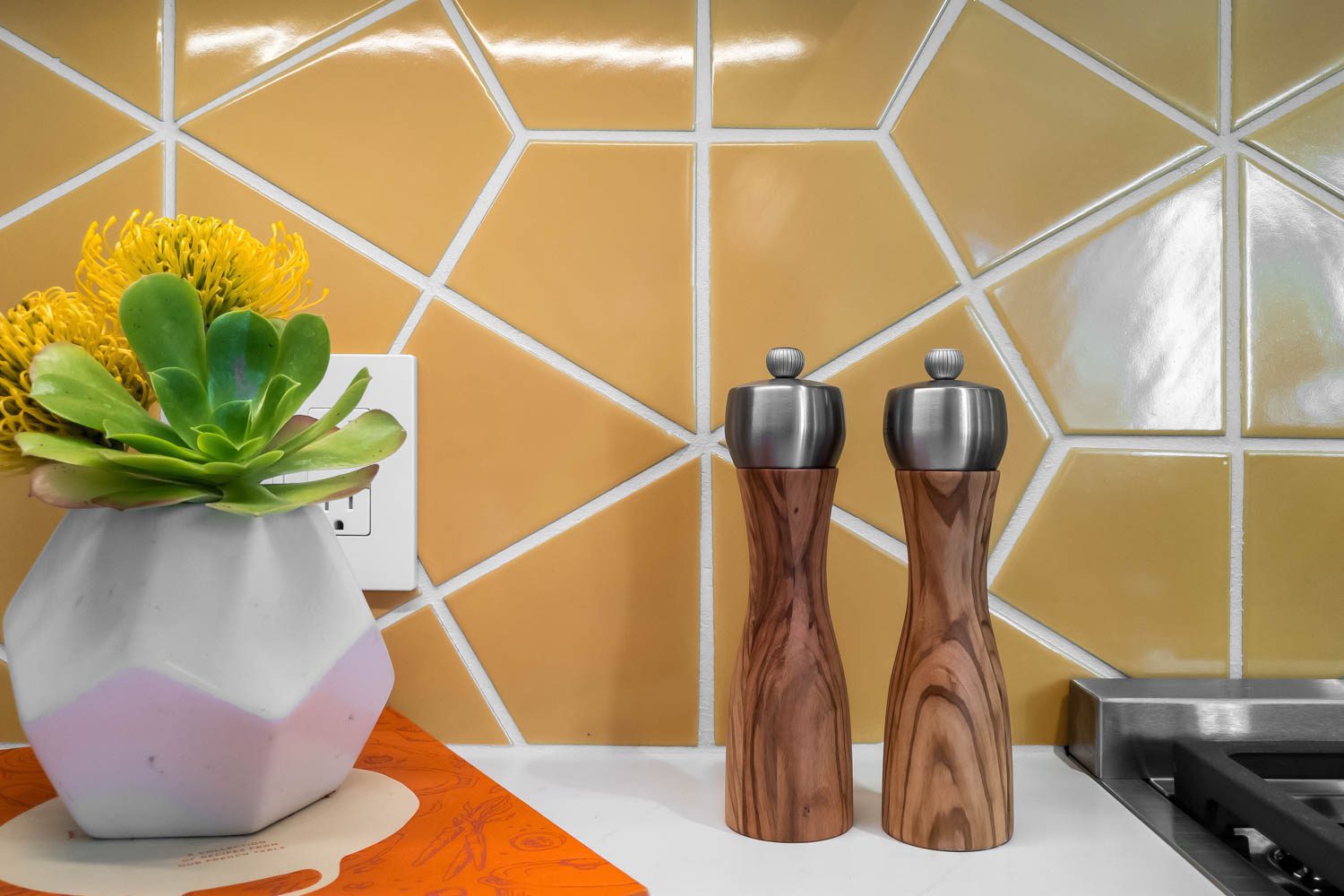
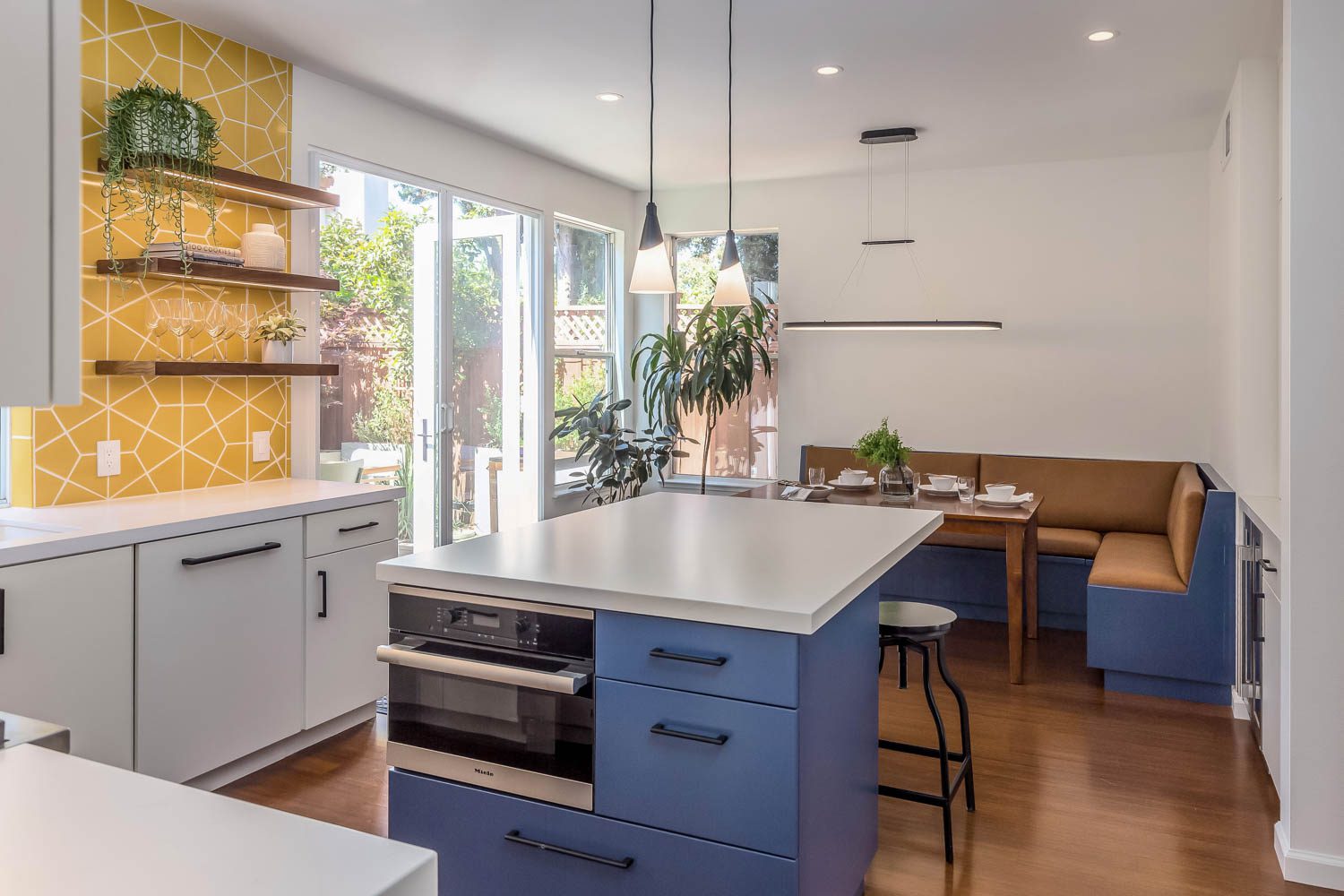
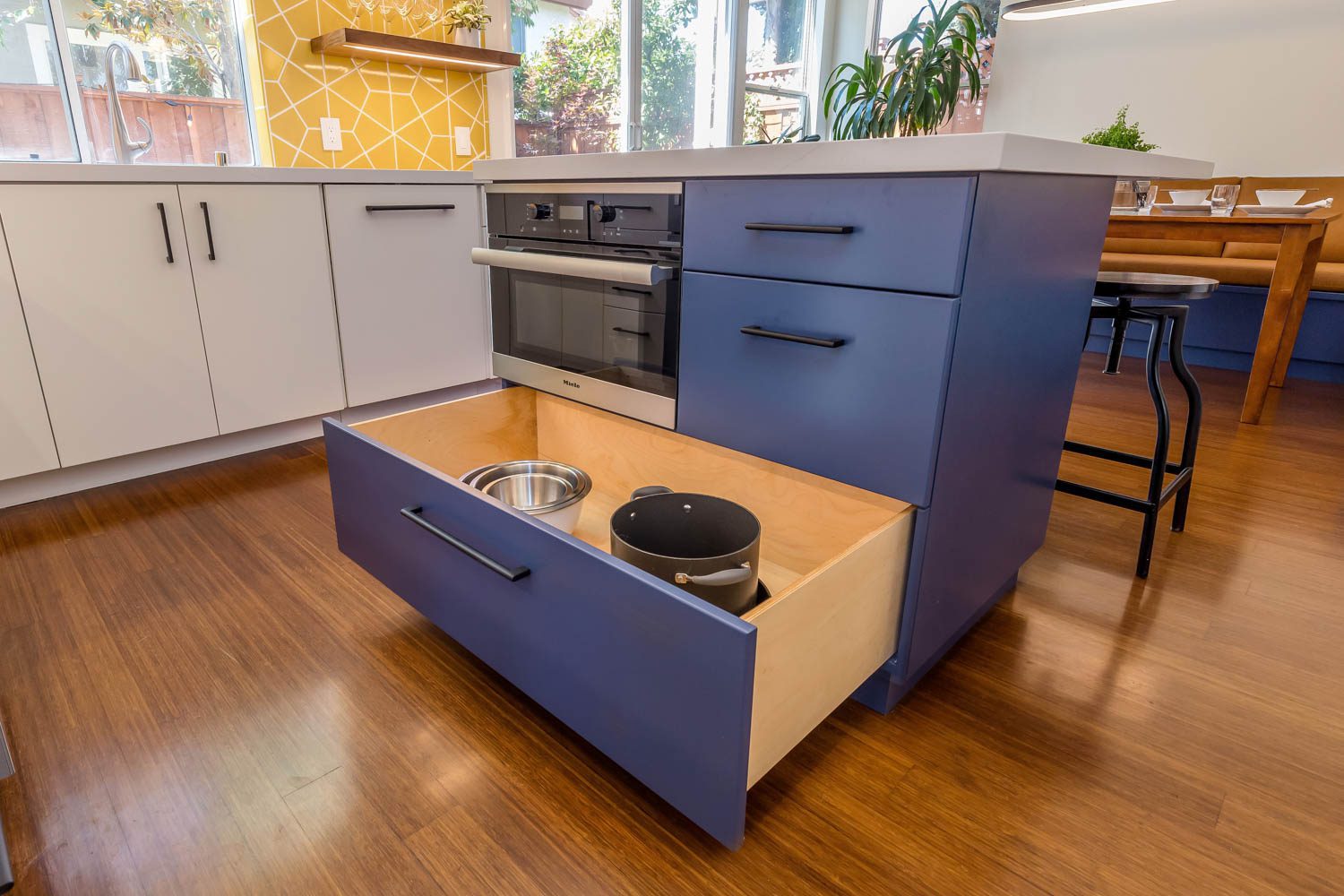
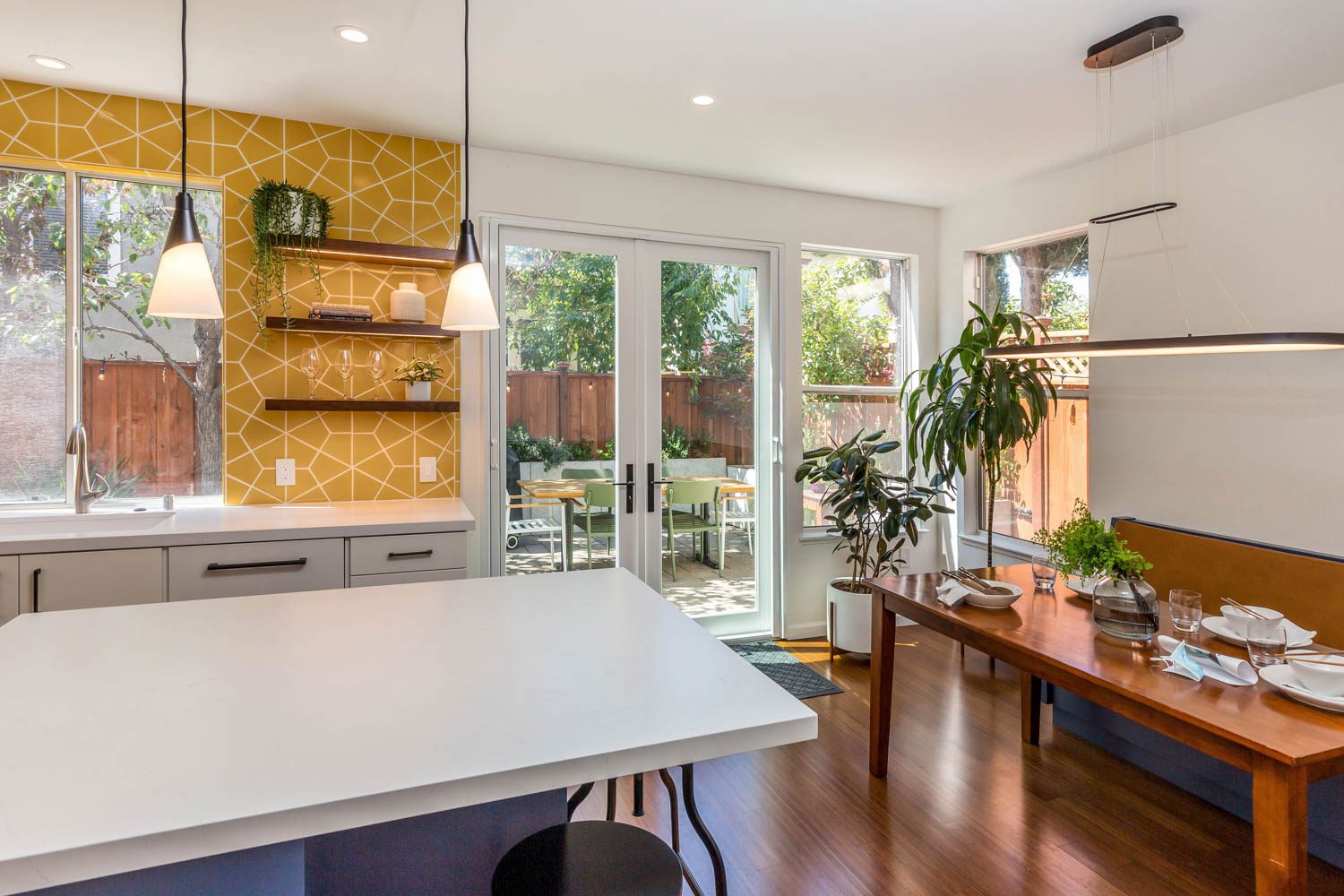
We kept the focus on the bright and bold design concept all the way through the project. The clients selected this beautiful bright yellow tile from Fireclay to be the focal point of the kitchen. For emphasis, we pushed them to go big and have the tile run all the way to the ceiling as well as around the kitchen sink window. To highlight the kitchen further, we added new recessed can lights, under cabinet lighting, and decorative hanging pendants above the island.
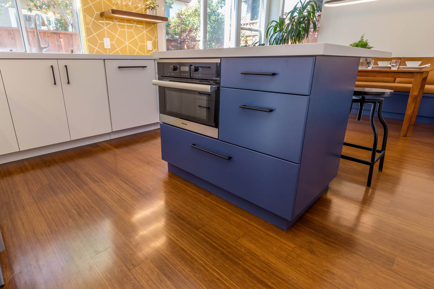
The kitchen appliances and sink were in practical locations, with the exception of the unsightly microwave hood. This island was proportionally small and had odd overhangs that were too shallow for seating. Lack of dedicated place for the trash can left it exposed under the island.
In order to pull the attention away from the large soffit, a custom hood was designed with a wide walnut band to harmonize with the rest of the walnut accents in the rooms. The walls were painted the same color as the white cabinets in a different sheen to disguise the soffits and seamlessly blend with the surrounding fixtures. The upper cabinet between the sink window and back door was removed and replaced with open shelving. The open shelves are accentuated by under-cabinet LED lighting.
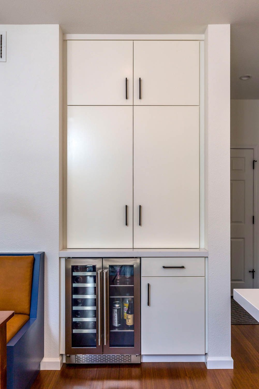
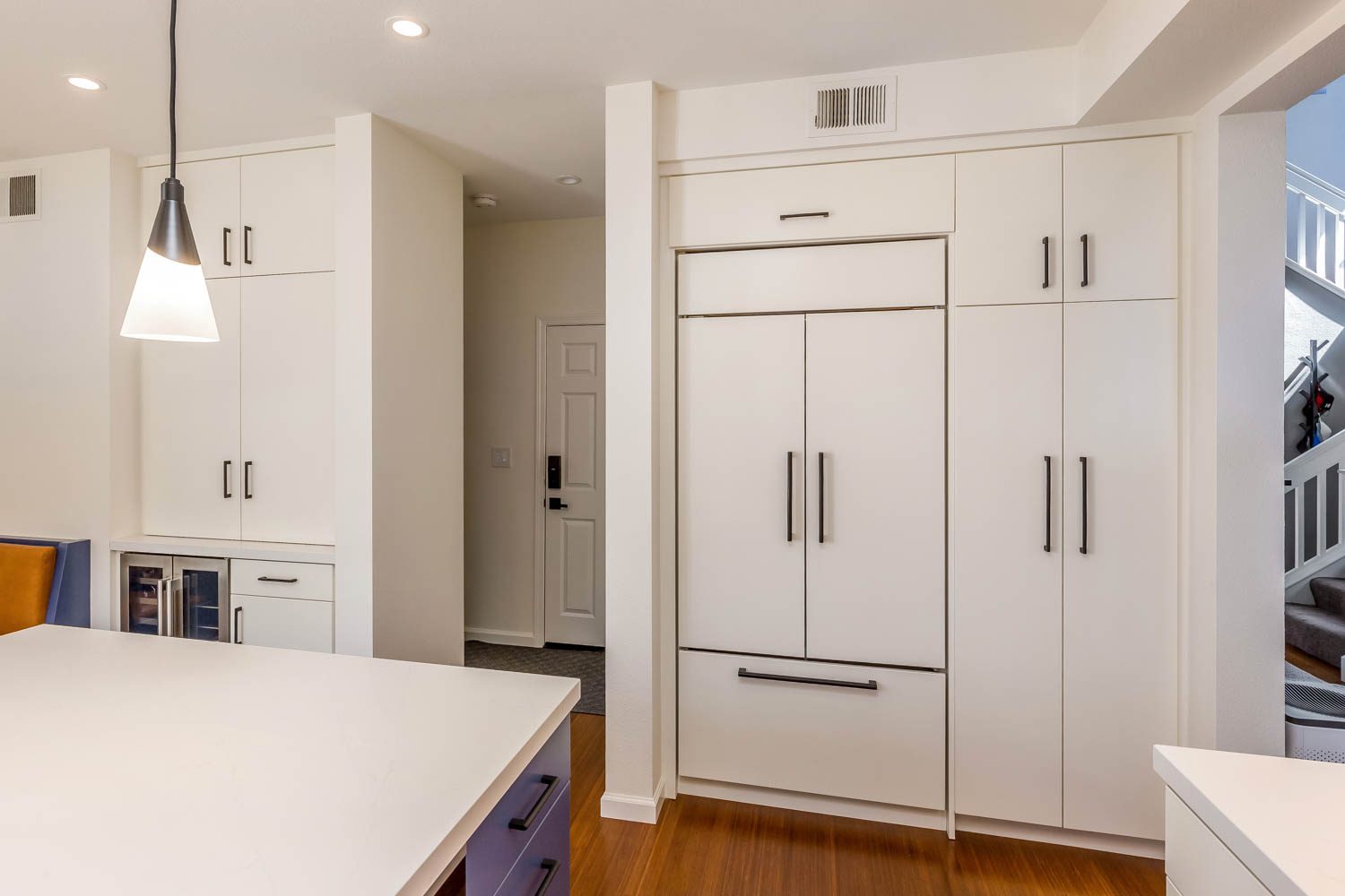
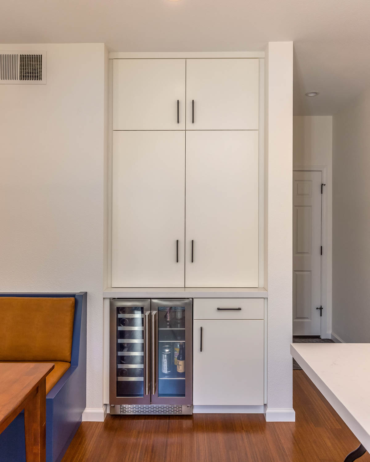
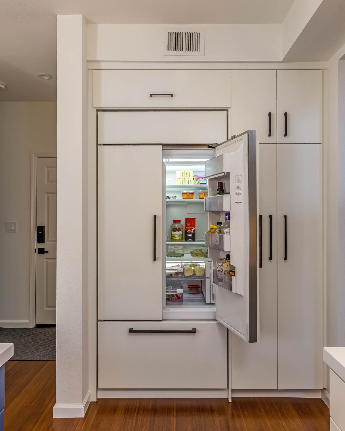
By paneling the front of the refrigerator, we were able to create a seamless wall of cabinetry. Using two pantry doors instead of one eliminated the issue of the previous large door blocking the entry. We created custom roll out-shelves inside the pantry to allow for easy access.
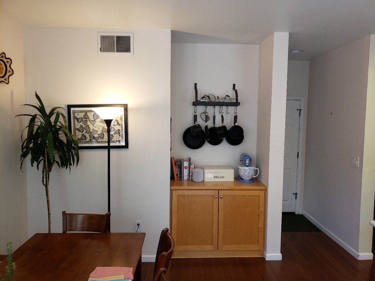
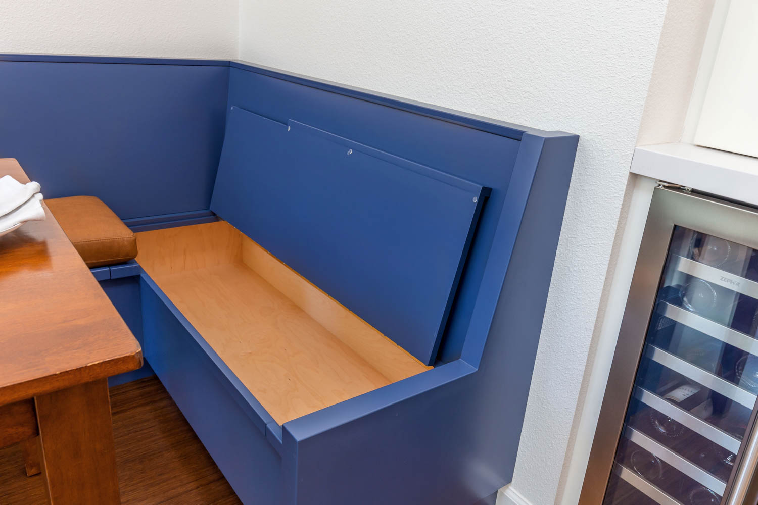
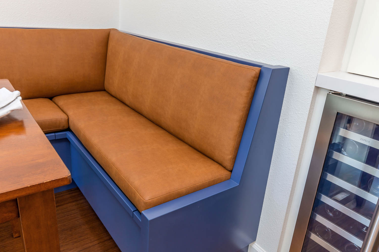
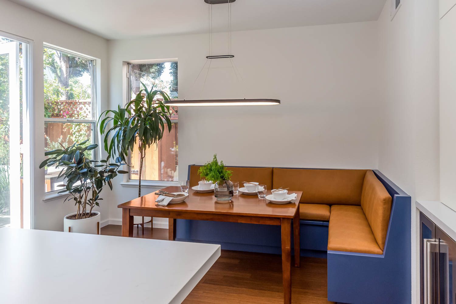
A custom bench was made to match the rest of the cabinets in the kitchen. This helped the two spaces to be cohesive, and the built-in bench defined this area as the dining location. Storage was built-in under the seat cushions, making it a subtle spot to hide away other necessities. A modern overhead light fixture provides simple ambient lighting.
