Transitional Mountain Shadows, San Jose
The Concept
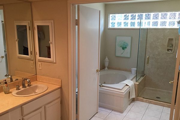
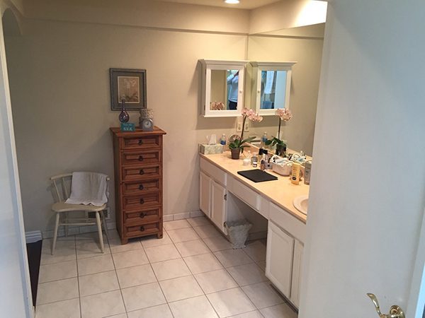
The Master Bath in this 1979 home had a small, outdated shower and a rarely used tub that not only ate up valuable space, but became difficult to access for these aging-in-place homeowners. The clients’ primary goals for the remodeled space were to remove the tub, expand the shower and incorporate as much easy-to-access storage as possible.
Expanding Possibilities
Architectural elements in the original master bath made it feel smaller than its actual 100-square-foot footprint. The short arched entry into the space reduced the ceiling height, and the remnant of a soffit at the vanity made the space feel very cramped and closed off, leading these homeowners to pursue a more open design.
Refreshed Vanity
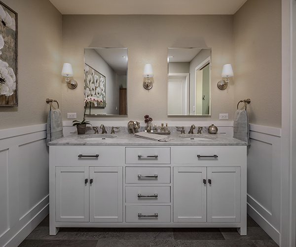
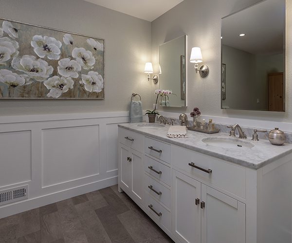
The only source of lighting was the overhead recessed cans, which created more shadows than usable task lighting for the client. The newly recessed medicine cabinets are flanked by sconces, adding both storage and layers of light at the vanity. The wainscot detail adds visual interest and a unique design element to a space that was formerly devoid of any style.
Eliminating the Tub
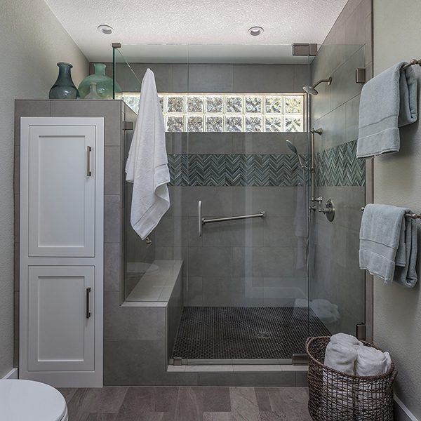
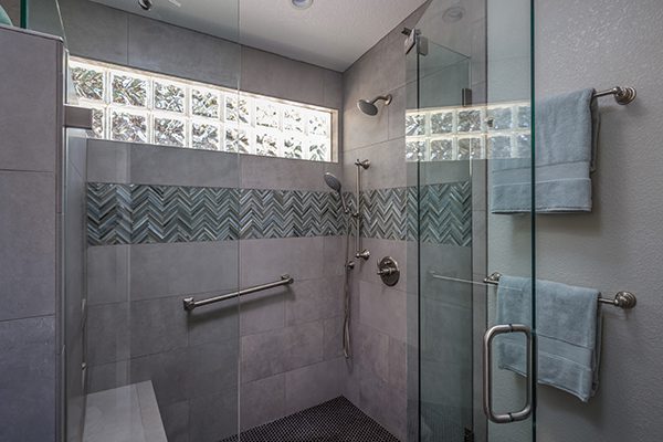
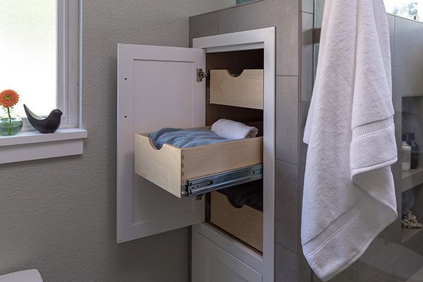
The unused tub ate up a huge portion of usable space in the wet area, and the outdated and cramped shower had a small, pre-fab niche that offered only minimal space for showering necessities. By eliminating the tub, the designer was able to almost double the shower space, giving the client the room to include custom niches and a bench in this aging in place bathroom design. We created a tall custom cabinet with pull-out shelves to maximize storage, and make the most of this new space at the end of the shower.
The Materials
The Westwood Design custom pull-out cabinets, seen attached to the shower enclosure, are the highlight of improved creative storage solutions in this newly redesigned bathroom. The linear motif of the accent tile helps to incorporate the existing glass block into the refreshed tile design. The luxury vinyl tile flooring from Mannington Adura Meridian pulls the color scheme of this aging in place bathroom design together, featuring the slip resistant and easy to maintain material that these clients were looking for.
