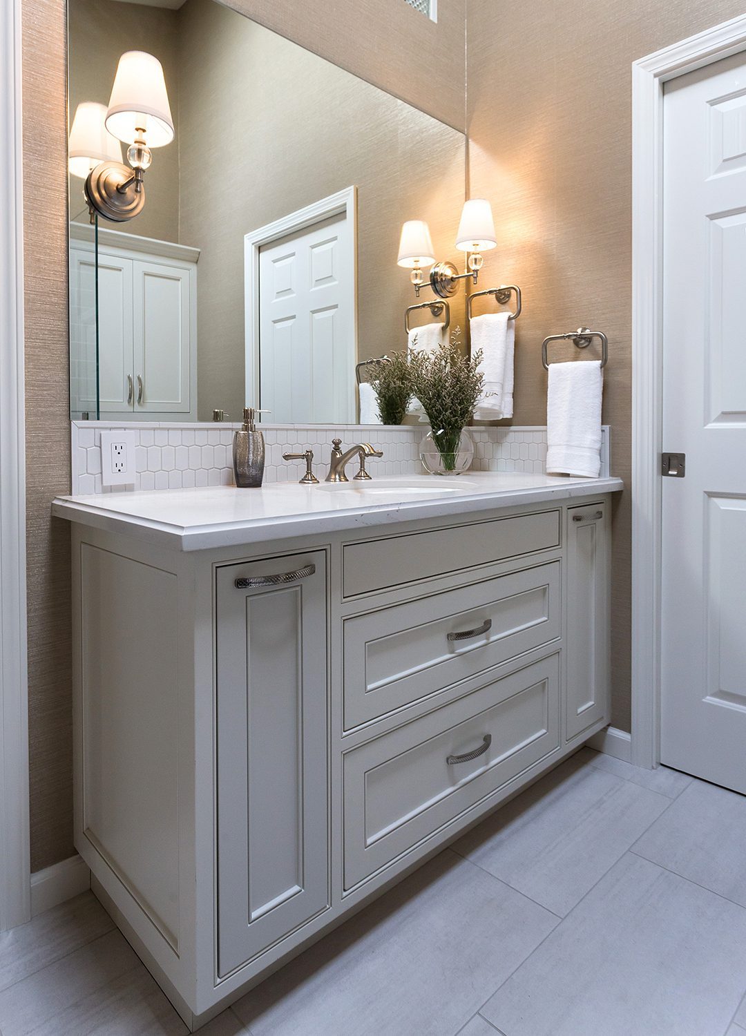
Transitional North Whisman, Mountain View
The Concept
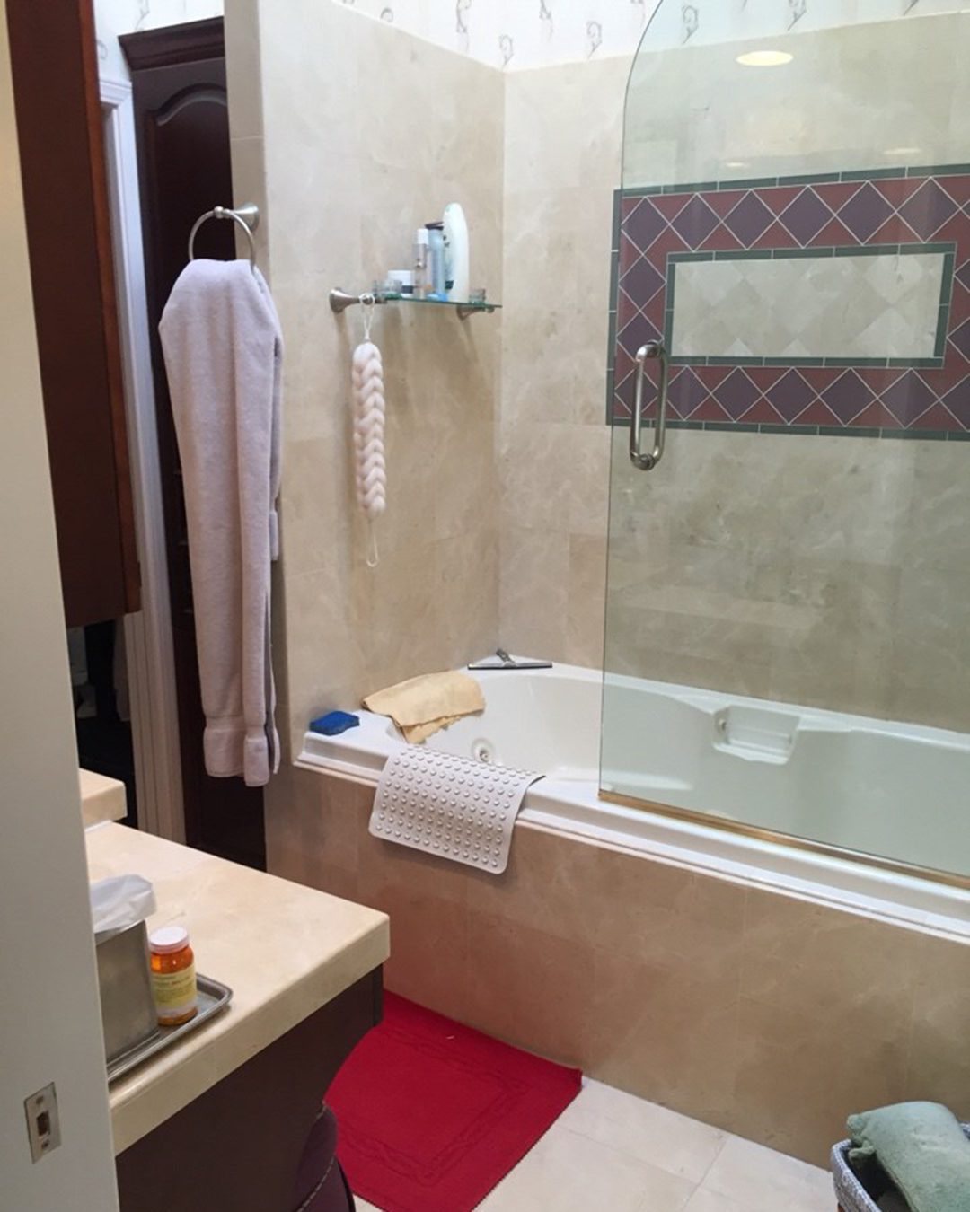
This client had once previously remodeled this master bath, but had fallen out of love with its dated design and dysfunctional placement of cabinetry. The re-design needed to address both the client’s current needs and future functional needs as her townhouse wasn’t properly designed to promote aging in place.
Must Haves
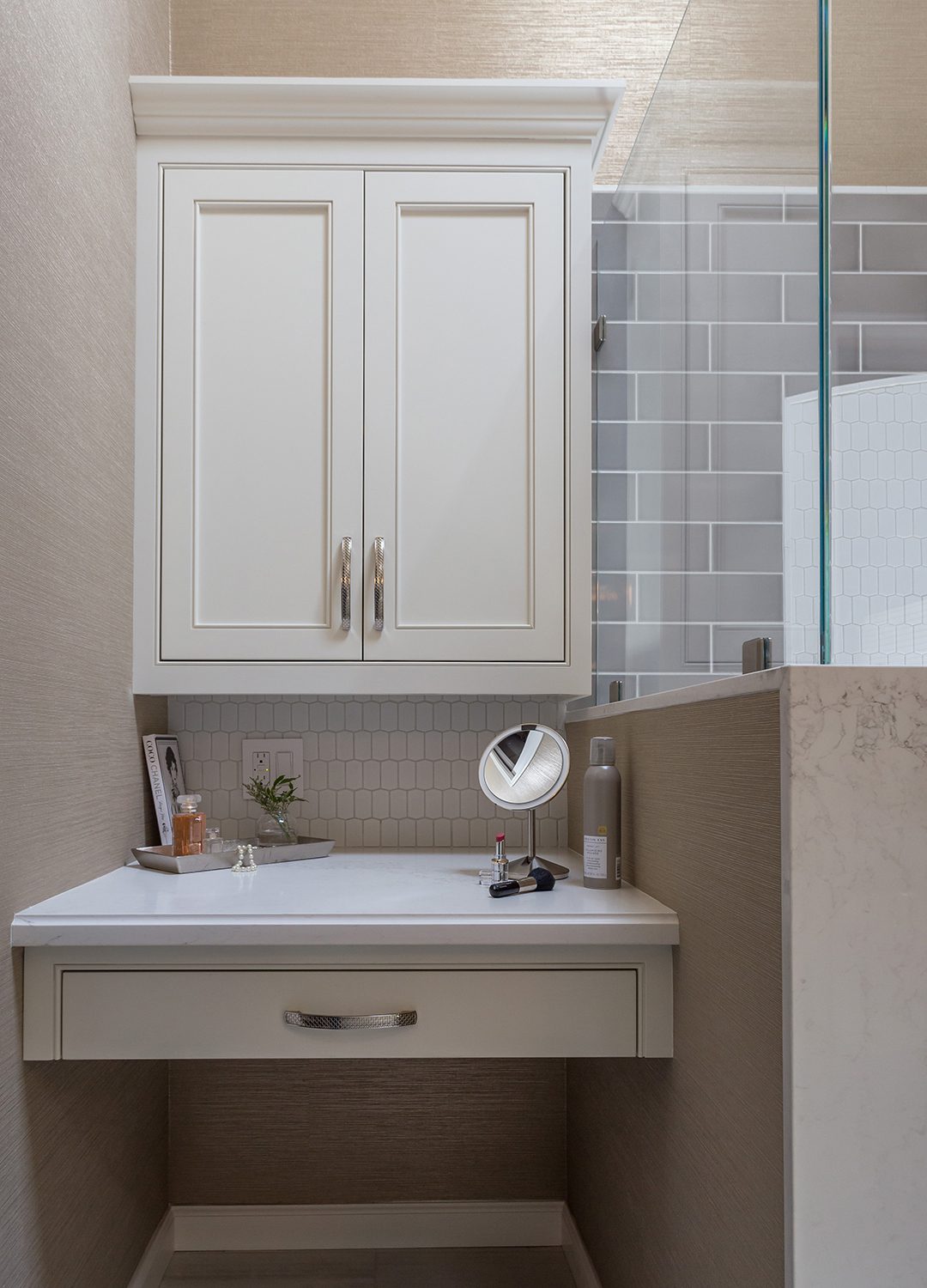
Design must-haves included a larger vanity with ample storage, eliminating the tub for a custom shower, and a dedicated makeup station with generous depth and a large wall cabinet for additional storage.
Parting with the Tub
The massive tub enclosure dominated the bathroom’s footprint and abruptly ended with a partition wall, creating a box-within-a-box feeling. The linen storage behind the partition was ineffective and created a sloppy transition at the closet. In addition, the height of the Jacuzzi tub made it difficult for the client to get in and out of, which would only get worse as she aged in her home.
Spacious Shower
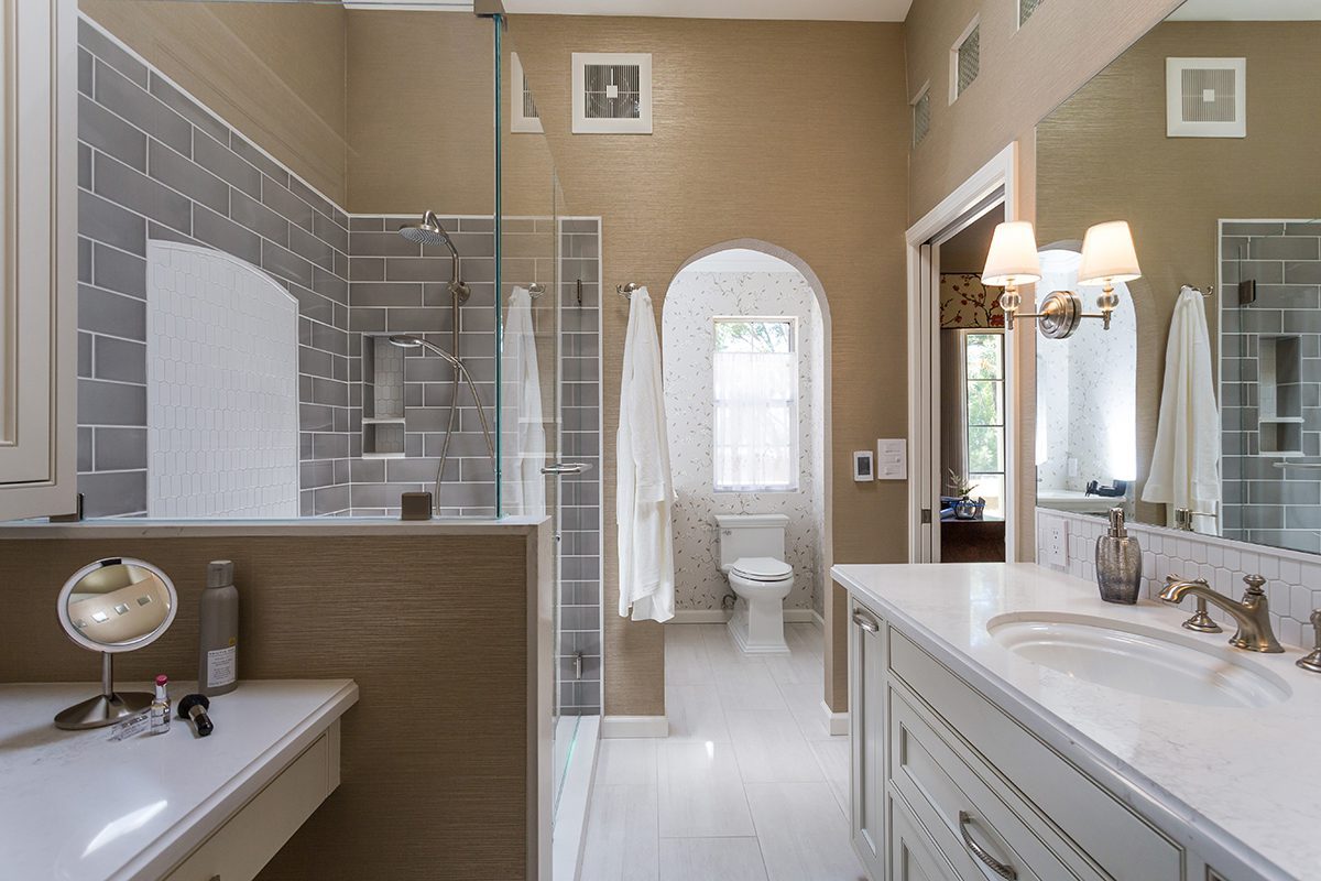
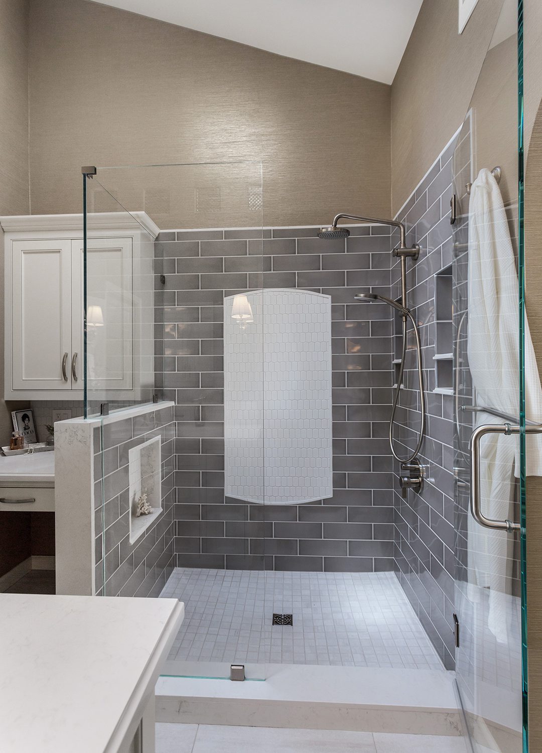
The decision to eliminate the tub created room for a spacious shower. Replacing the partition wall with a pony wall visually expanded the space and created the opportunity for a niche to keep the focus on the decorative mosaic on the back wall.
Room for the Beauty
By removing the tub, we were also able to rid the linen storage and re-locate the makeup station from the main vanity to create its own space. Designating a separate area for the make-up station allowed for a 5-foot single-sink vanity with ample storage for toiletries and towels. The large plate mirror opened up the space further.
Vanity Essentials
The storage needs of the new makeup station are met by both drawer and an upper cabinet. A dedicated outlet and under cabinet lighting provide the essentials for performing makeup tasks.
The Materials
A bright, light palette refreshes the space and provides a contrast to the darker tones in the bathroom. The ceramic shower tile by Bedrosians Tile & Stone in the color Grigio brought the light to the room that it needed.
Fresh & Bright
The white ceramic accent tile seen in the shower from Ann Sacks gave the shower a pop and added an extra ray of brightness. The quartz countertops in Calcutta Nuvo were a great way to refresh the previous beige-colored countertops that made the room seem dim.
