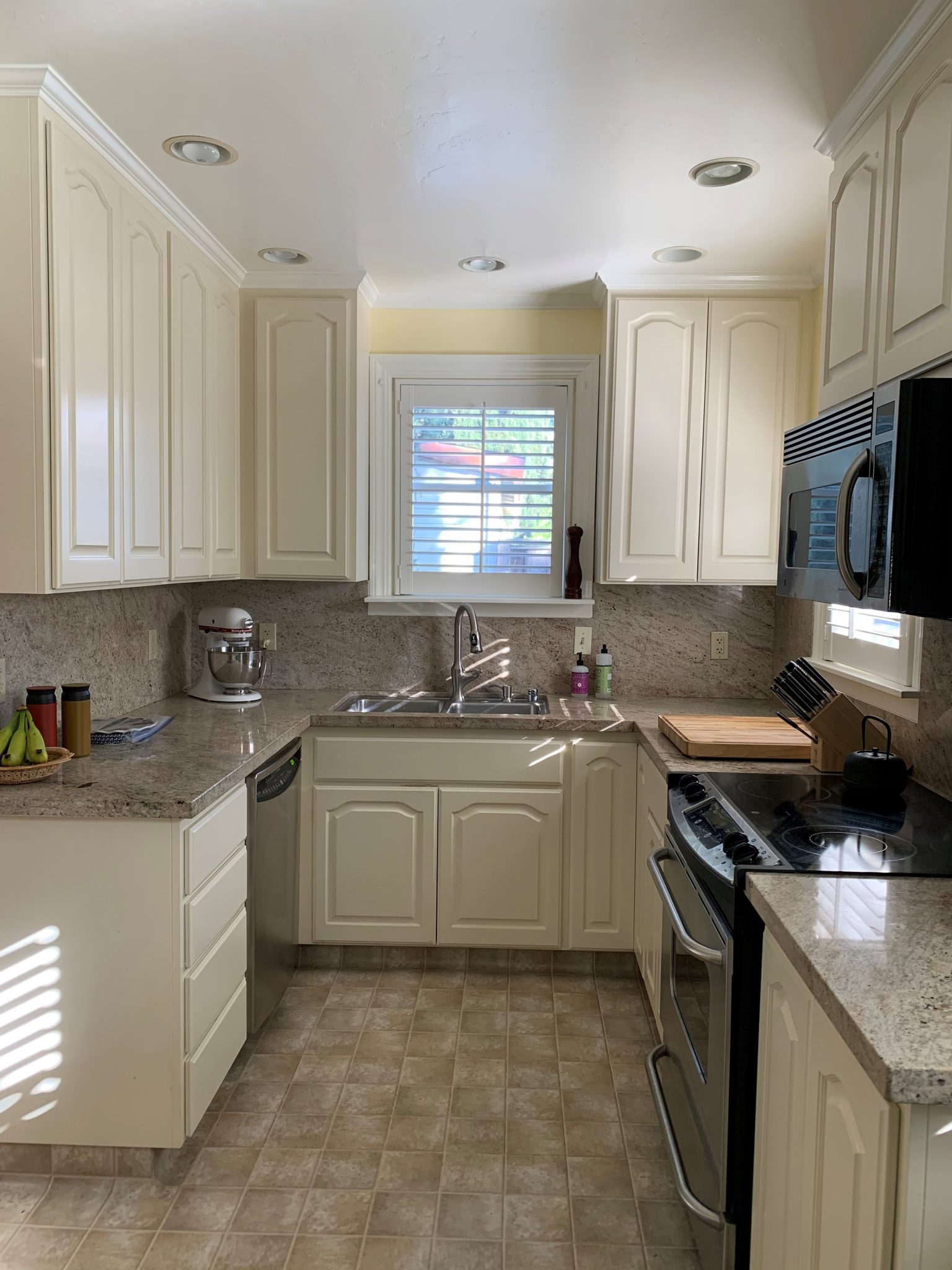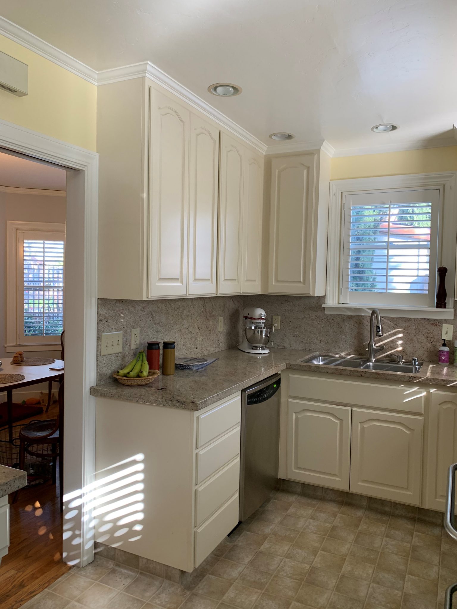
The kitchen had been updated by a previous owner, but the appliances and plumbing locations were awkward and inefficient. The sink was offset from the window and had an unappealing view into the driveway. The dishwasher was in the corner adjacent to the sink, creating a roadblock to the sink when the dishwasher door was extended. The upper cabinets were too tall and reached the 8’-6” ceiling height, making it impossible to reach anything past the second shelf.
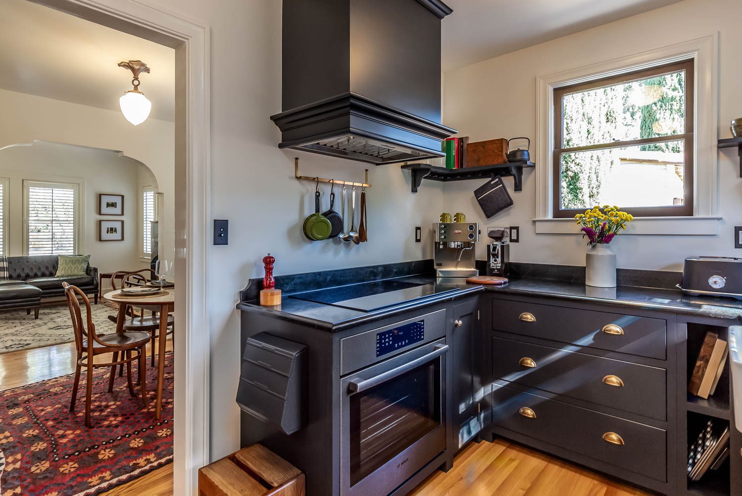
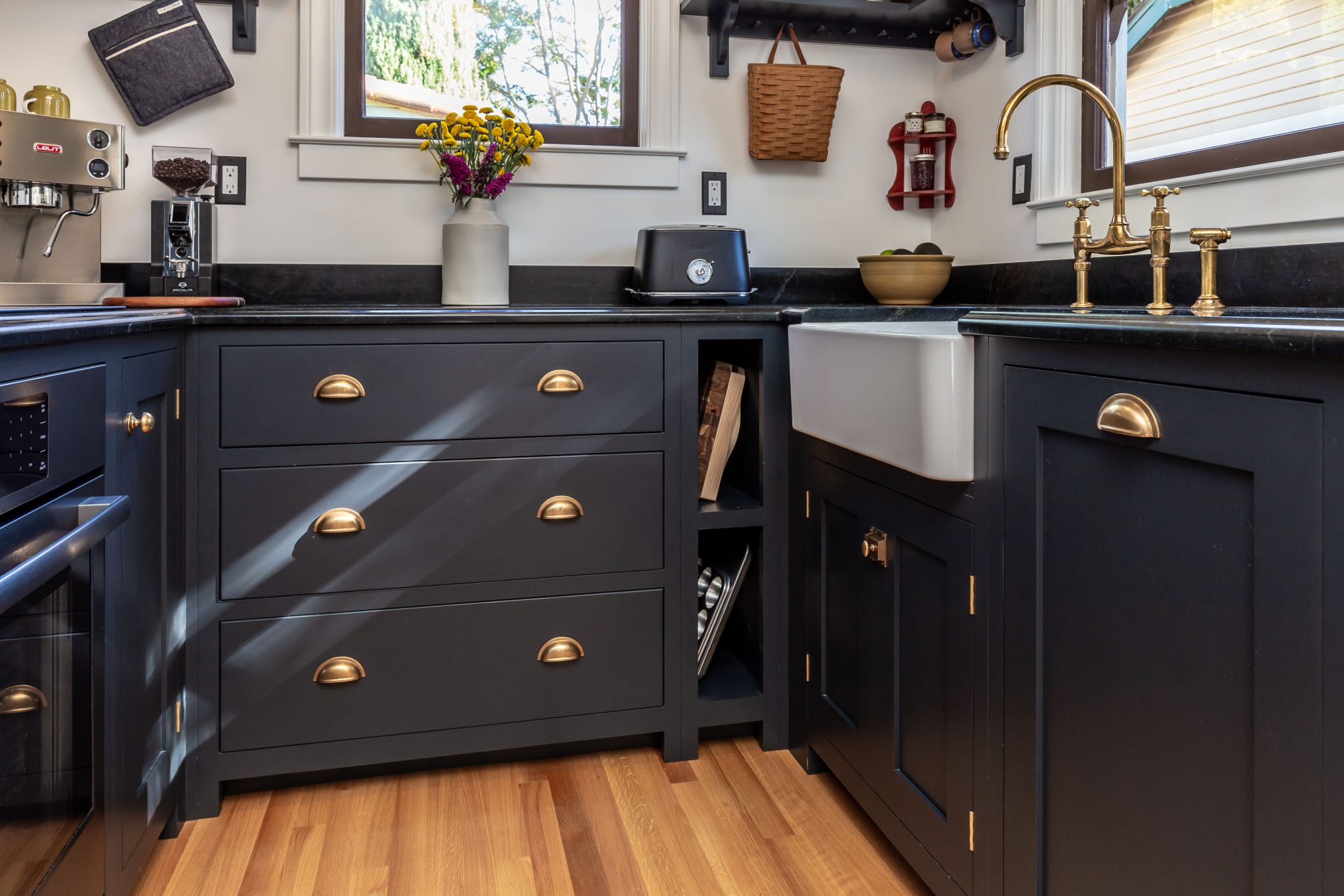
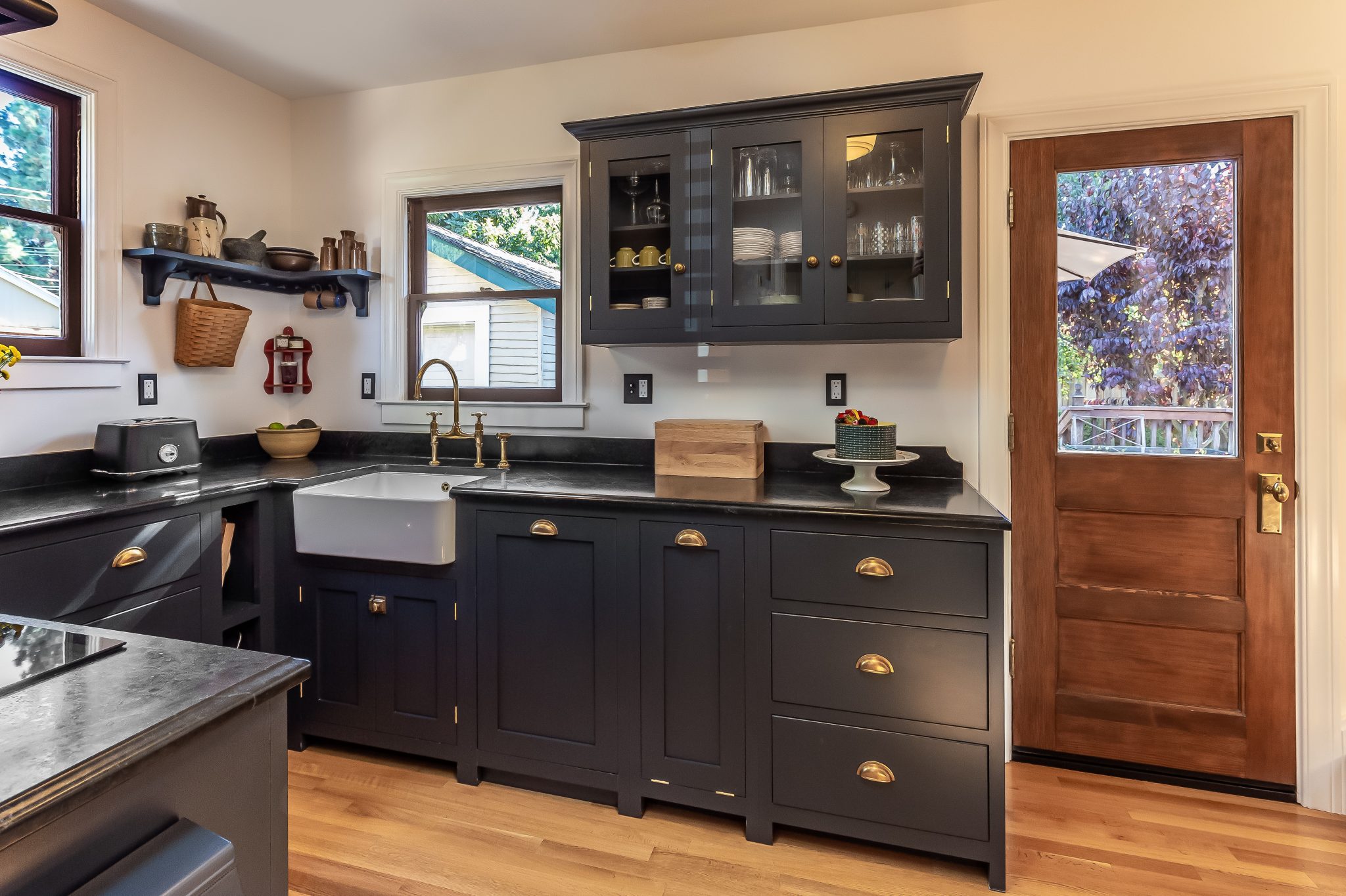
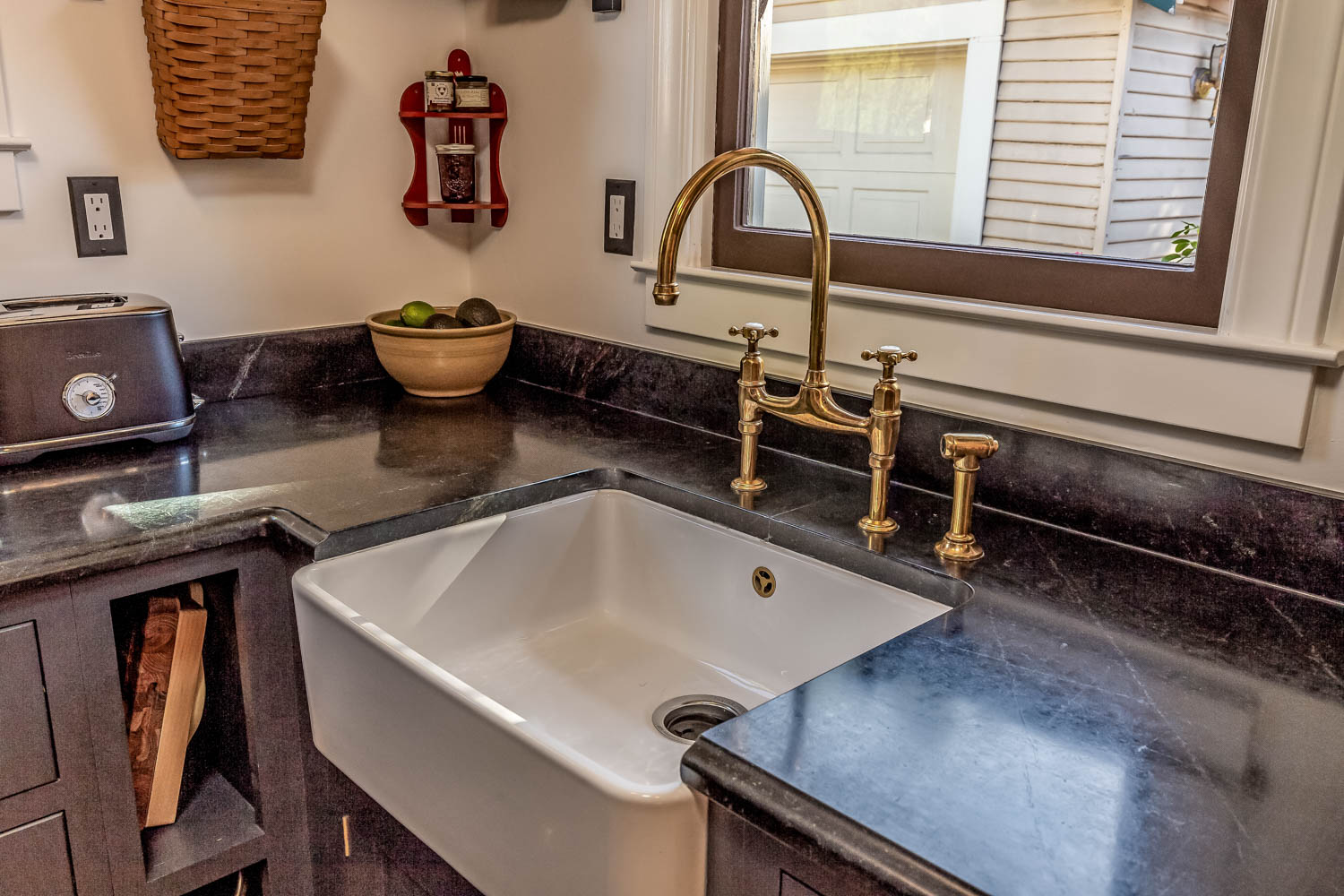
It was important for the clients that the newly remodeled kitchen mimic the vintage character of the rest of the home. Cabinets were sourced from DeVOL Kitchens, an English company that designs and crafts authentic Shaker cabinetry. The cabinet boxes are smaller in scale than American standards, offering more storage for smaller spaces and unique options such as corner shelves, pegs, and a stand-alone pantry cabinet for extra kitchen storage. Open shelving offers space to display the clients’ collection of vintage dishware. The traditional farmhouse sink is centered under a window that overlooks the back garden.
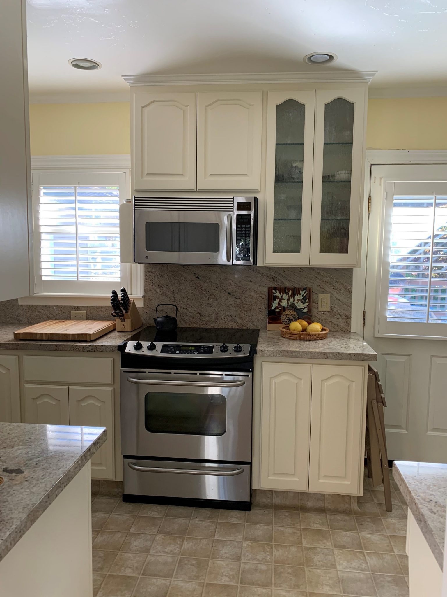
The locations of the existing range and microwave/hood were in the direct line of sight from the living room. Combined with the vanilla palette of materials that weren’t true to the heritage of the home, the appliances as the center of attention were an eyesore. The existing fiberglass back door was not original and would be replaced in the remodel.
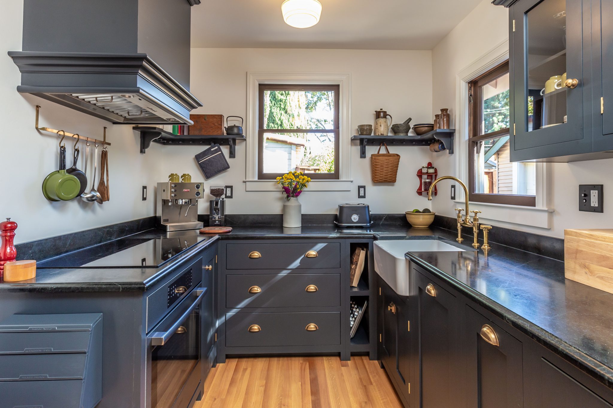
The new cooktop and oven were moved to the opposite wall and out of the direct view from the living room. Upper cabinets with inset glass doors showcase the client’s dishware collection. A paneled, 18” dishwasher sits next to the sink; its non-standard size helps maximize cabinet space. A solid-wood back door replaced the molded fiberglass door. The original window frames were carefully removed, sanded, and painted. While the siding was being replaced, the kitchen windows were reset and made level.
The existing plumbing layout made it impossible to use the kitchen sink and load the dishwasher at the same time. The upper cabinets met the ceiling and visually dominated the tight space, making the kitchen look and feel much smaller. A narrow pocket door blocked the interaction between the kitchen and dining room.
The pocket door was removed, and the opening widened between the dining room and kitchen to create the feeling of a larger space. The upper cabinets were replaced with a custom-wrapped hood. Eliminating the upper cabinets drew the eye to the 8’-6” ceiling height and created a sense of spaciousness. The wall between the dining room and the kitchen was packed with plumbing and venting, thus the layout of each pipe and vent had to be tightly coordinated to fit perfectly. Soapstone countertops, a typical material in a 1930s home, complement the charcoal cabinetry finish and contribute further to the modern vintage look of the kitchen.
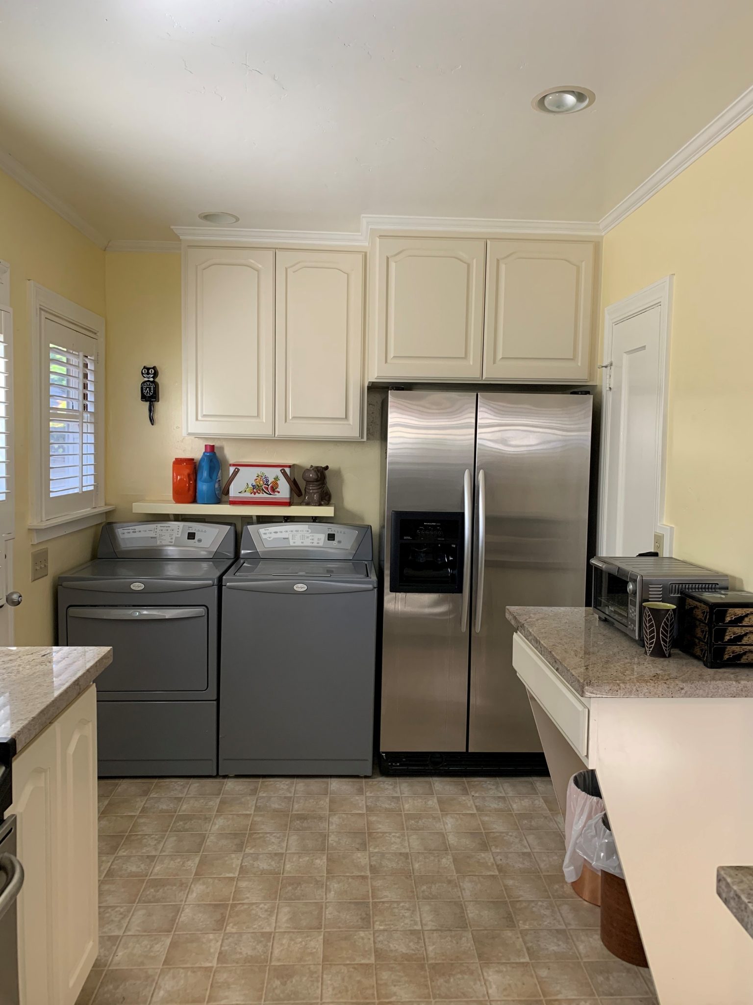
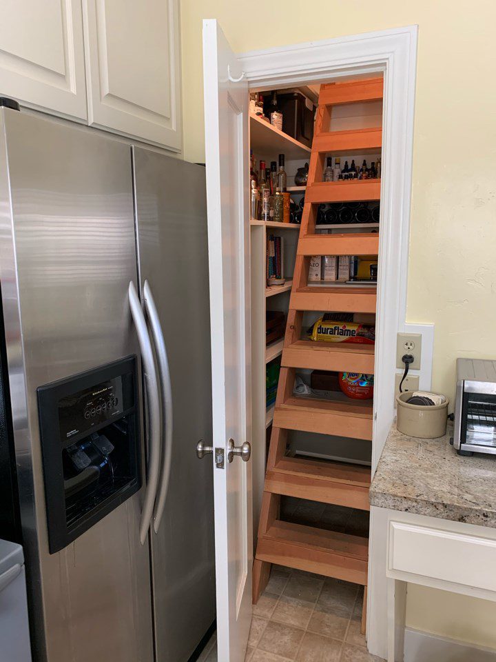
The refrigerator and existing laundry space were crammed into kitchen, creating an inefficient layout and a space filled with too many appliances. A small pantry located next to the refrigerator housed a ladder that was the only entrance point for the attic. Accessing the attic through this route was tight and unsafe. A built-in desk in the middle of the kitchen was an obstacle to the kitchen’s functionality.
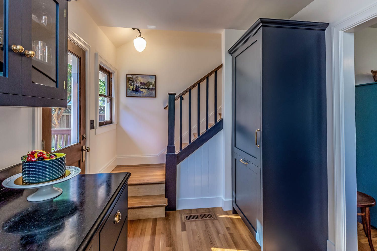
A main goal for the remodel was to create a safe, accessible entry point into the attic. The washer and dryer were relocated in order to carve out space to build a staircase to the attic. The refrigerator was moved closer to the kitchen’s work-stations. The appliance is paneled to not distract the eye from the new modern vintage kitchen design. Vinyl flooring was replaced with hardwood to blend with the original floors throughout the home.


