The Concept:
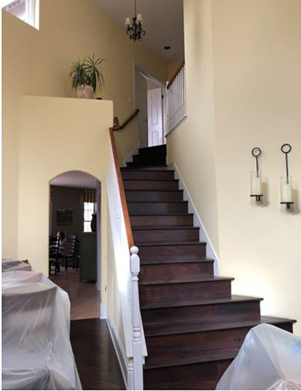
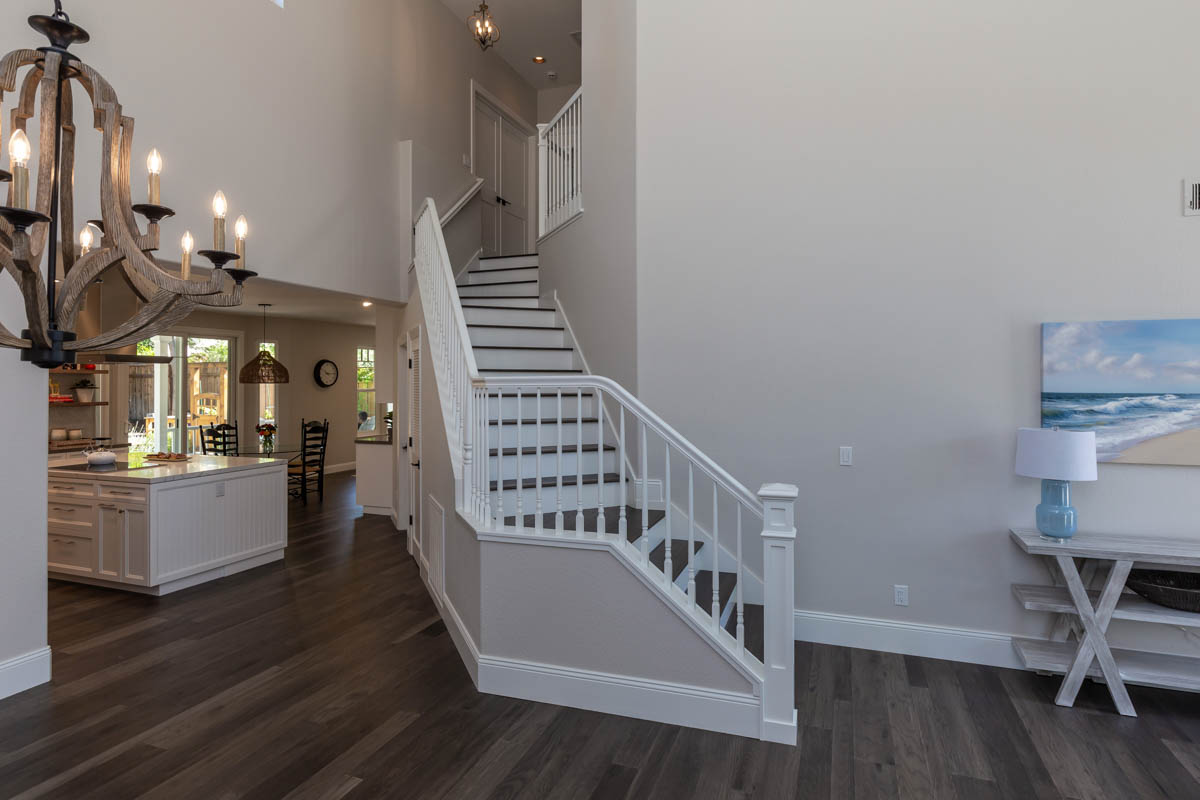
Built in the early 90s, the first floor of this 2,300-square-foot home was segmented into two halves that did not interact. The living and dining rooms occupied the front half of the home, with a wide staircase encroaching into the dining space. A structural wall with a small opening led to the home’s back half, where the kitchen, breakfast nook, and family room spaces were hidden from view. The client’s goals were to open the wall between the dining and kitchen for better flow, narrow the staircase footprint, and refresh the overall kitchen design and layout of the family room.
A Separated Home:
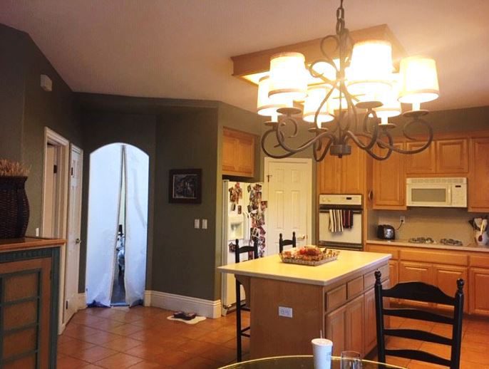
The main gathering spaces in this 25-year-old home were separated by a structural wall with a small opening that hid the kitchen/nook/family room from the voluminous space at the front of the home. The staircase jutted into the dining room, interrupting the flow. The finishes and features in the kitchen and family room were dated and tired. The narrow kitchen island faced away from guests in the nook and family room.
Creating Flow:
The structural wall was removed, providing a clear sightline from the dining room through the kitchen and into the back garden. A 13’ semi-flush beam was installed to support the second floor. The staircase direction shifted to align with the front door opening, minimizing its footprint in the dining room.
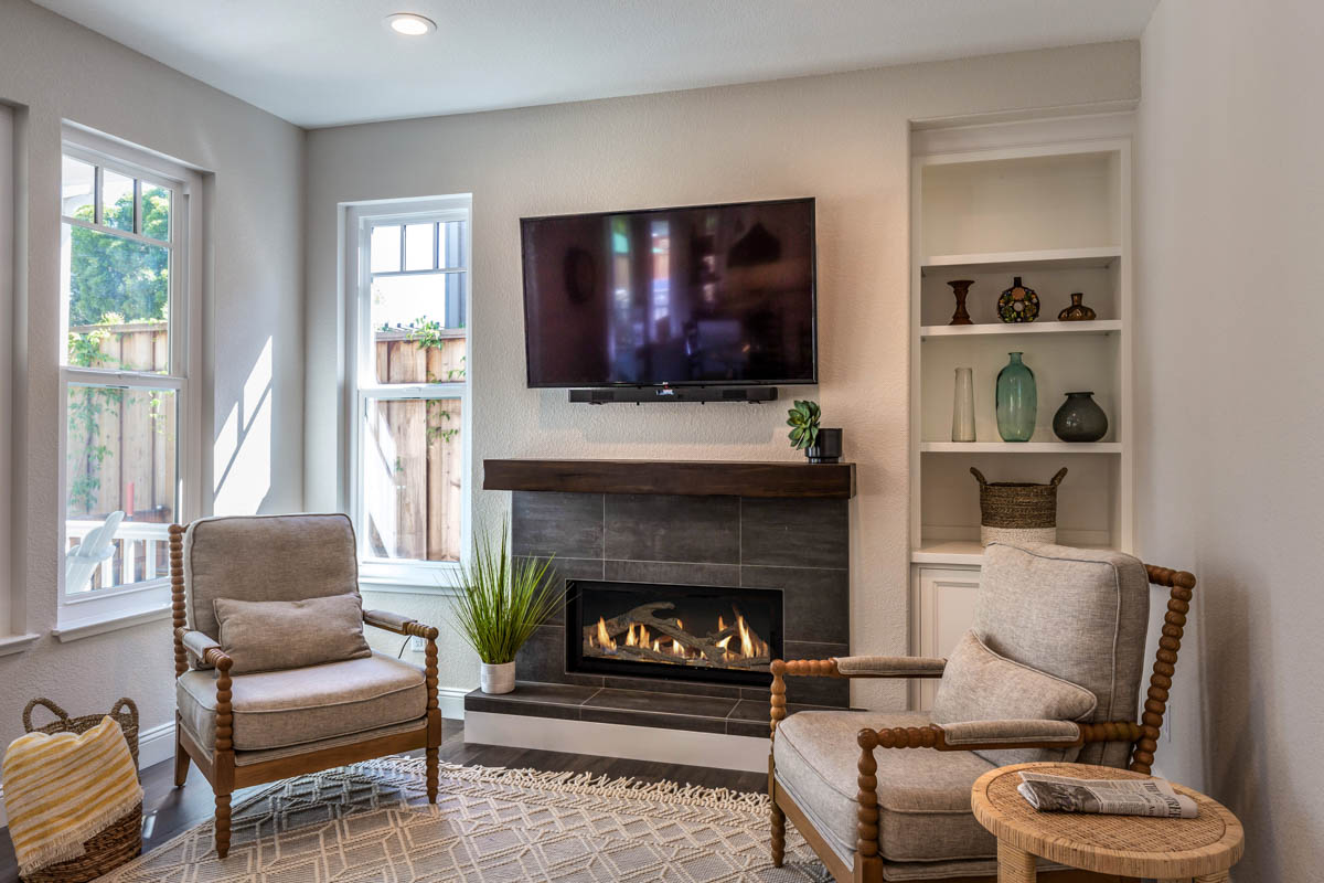
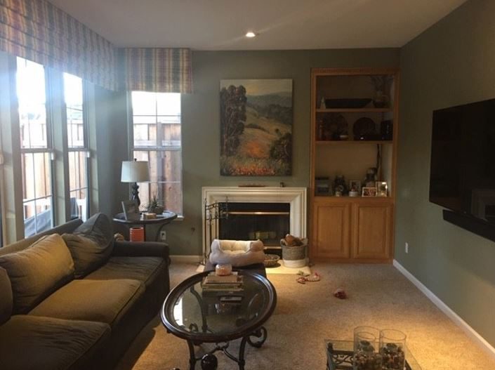
The original kitchen was designed to open to a dark family room that needed a style update. The fireplace façade was bland and elements on the fireplace wall made it appear asymmetrical. The television location made it difficult to view from the kitchen and breakfast nook. The fireplace’s stylish update included a linear gas insert, porcelain tile façade and hearth, and a rustic wood mantle. We decreased the width of the built-in cabinetry to create more symmetry with the opposite window. Bright white walls visually enlarge the welcoming space.
An Outdated Kitchen:
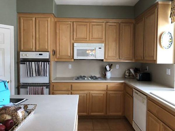
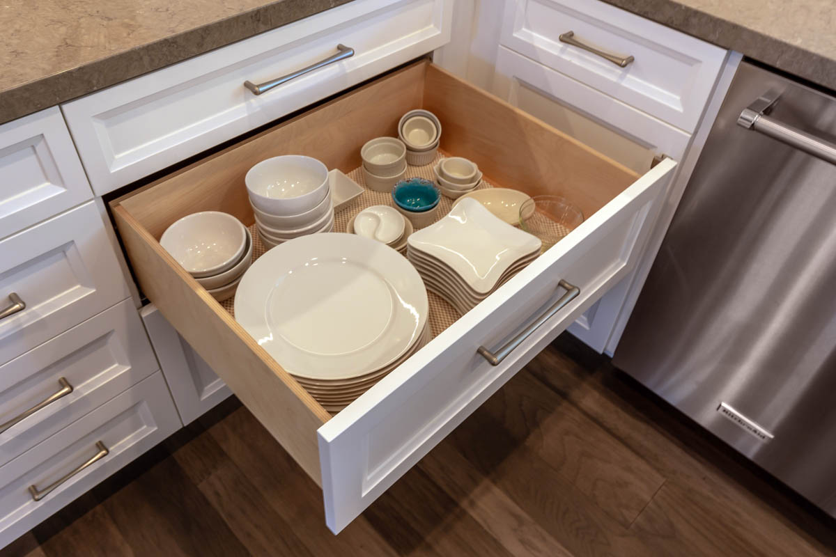
The cabinetry had a lot of wasted space and was challenging to access for the petite homeowner. The cabinet style was dated and the cooktop on the perimeter counter used valuable counter space for landing zones and work prep. The microwave/hood did not provide adequate venting for the client’s gourmet cooking.
The kitchen felt dark because of the visual weight of the soffit combined with the window valances used throughout. The client wanted a lighter look and storage solutions that would minimize counter clutter.
A Bright, Crisp Space:
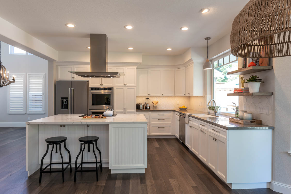
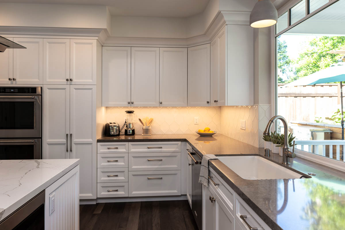
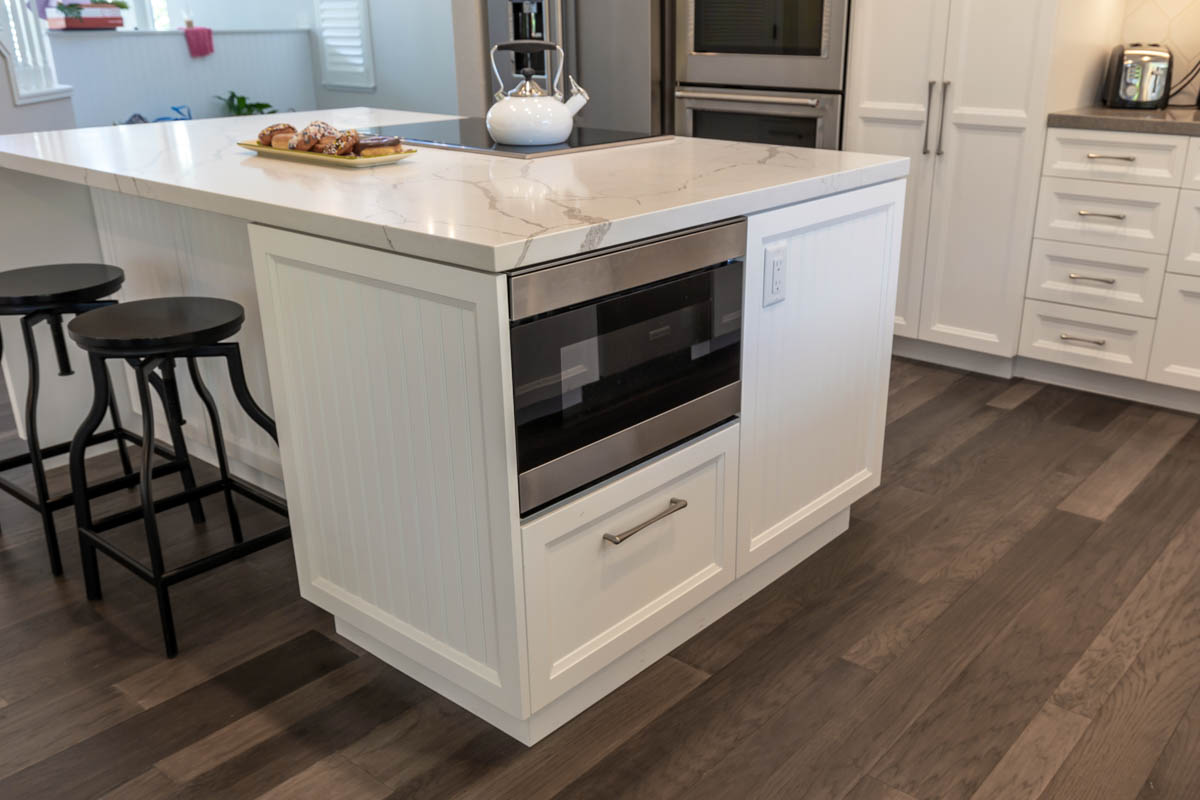
The new pull-out pantry next to the wall ovens provides plenty of storage for everyday needs. The microwave is moved to the island, providing uninterrupted storage in the cabinet uppers. The designer added a thick decorative molding to the cabinet tops, adding architectural detail at the transition to the soffit.
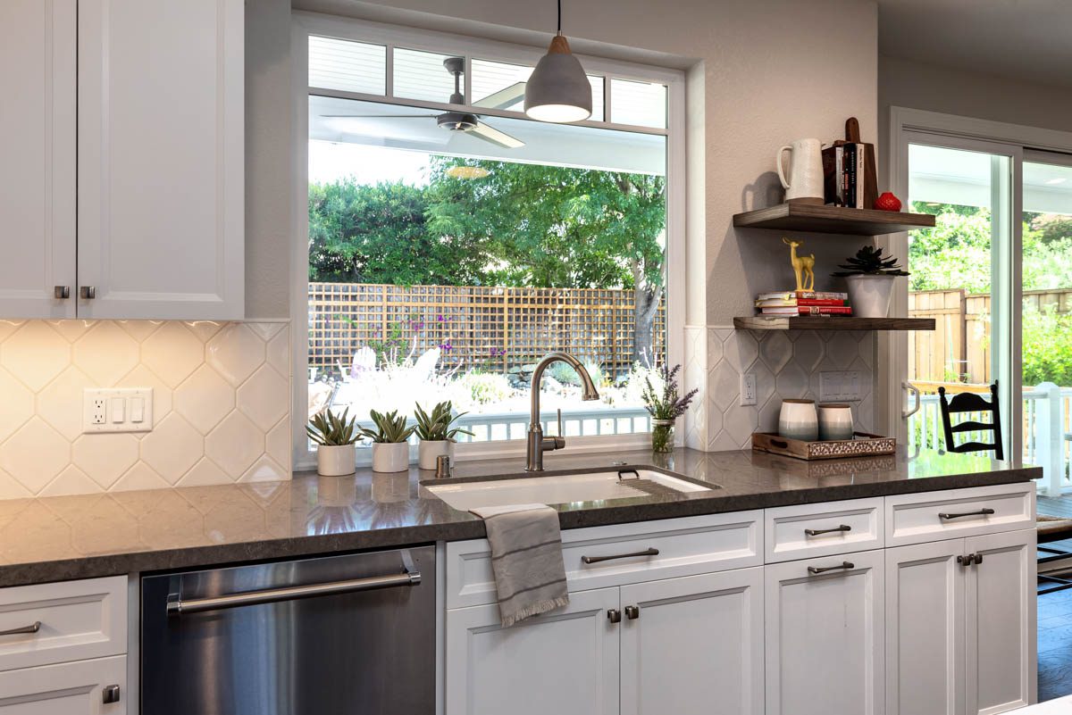
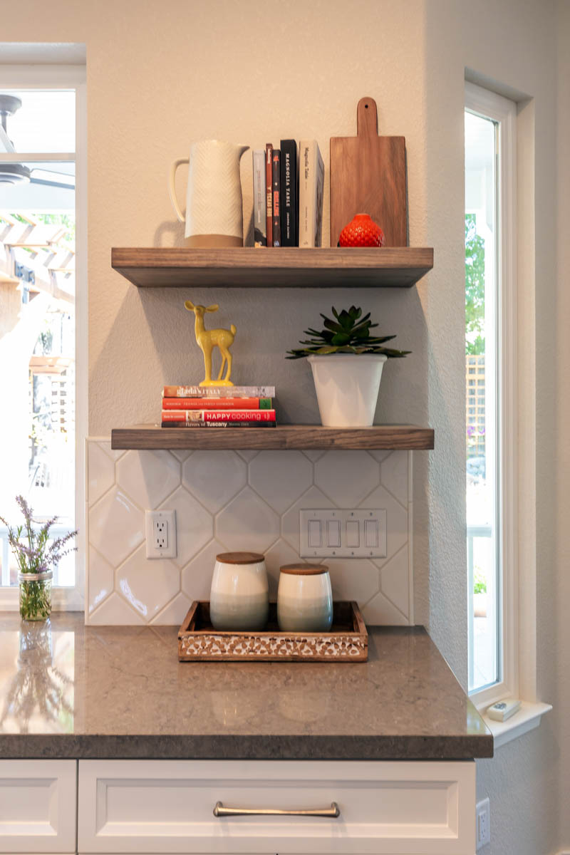
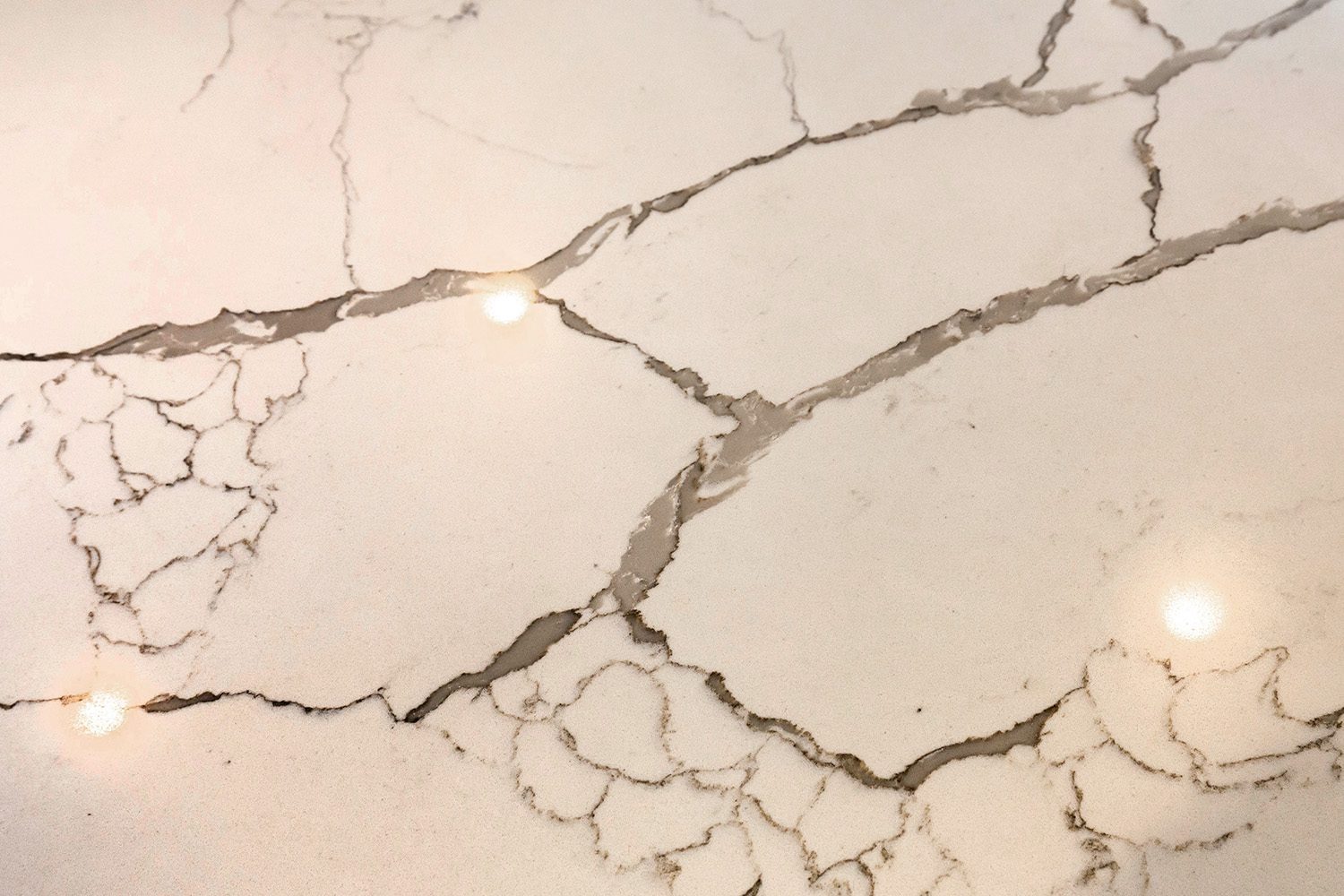
An all-white palette accented with the dark gray perimeter counter washes the space in bright light. The bulk of the soffit is visually minimized by painting it same color as cabinetry. A Calacatta-like quartz counter provides an elegant, easy to maintain surface cooking at the island. Open shelving on the opposite side of the sink provides some visual relief to the weight of the upper cabinets and offers a spot for display.
Dry Bar:
A furniture cabinet stored items for cocktails and served as a transition between the kitchen and family room.
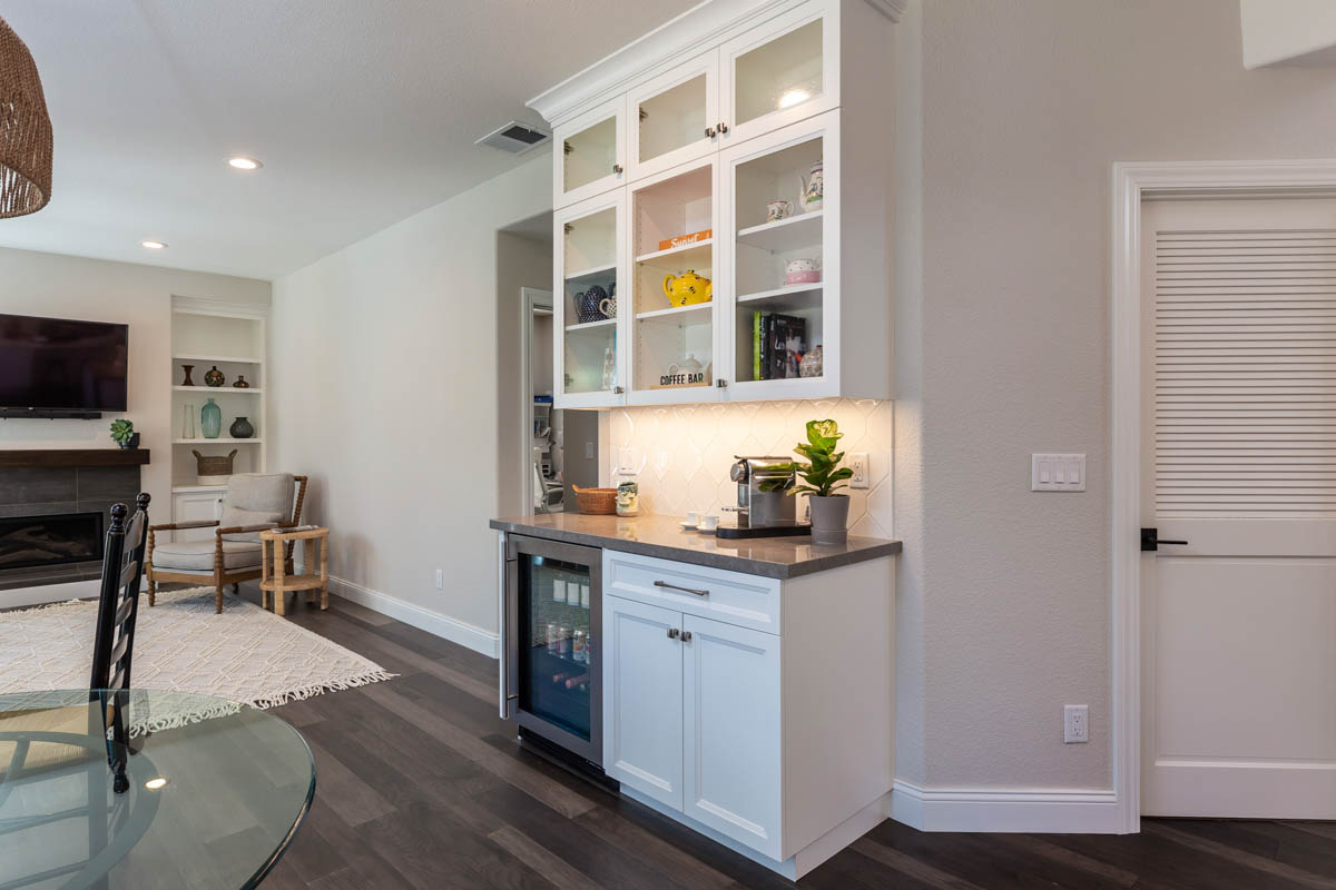
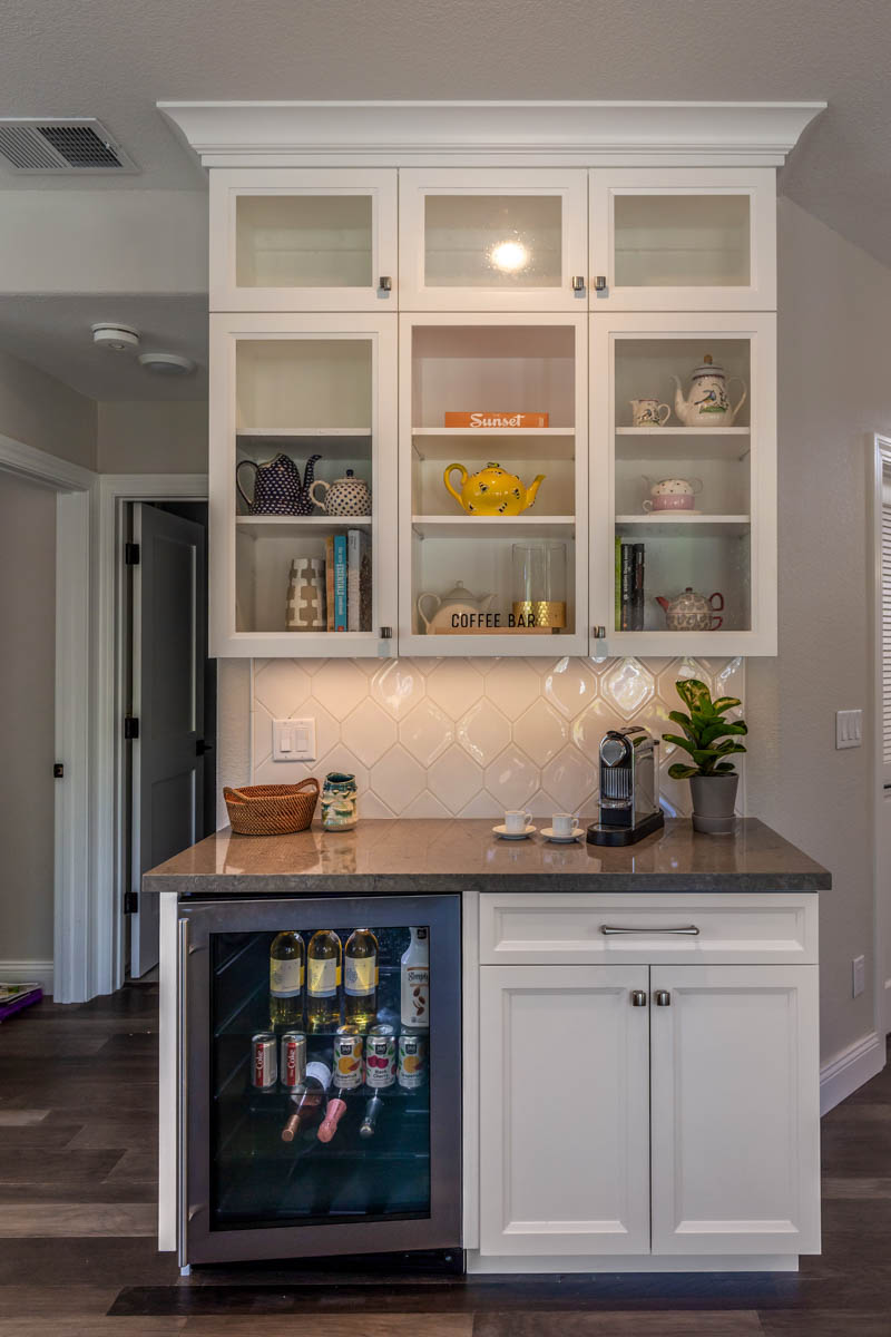
The new dry bar houses a beverage fridge and plenty of storage for everyday coffee/tea needs and serves as a prep space for cocktail parties. The location is centered between the kitchen and family room, a convenient spot for drink prep that doesn’t get in the way of cooking in the kitchen.


