Modern Menlo Oaks, Menlo Park
The Concept
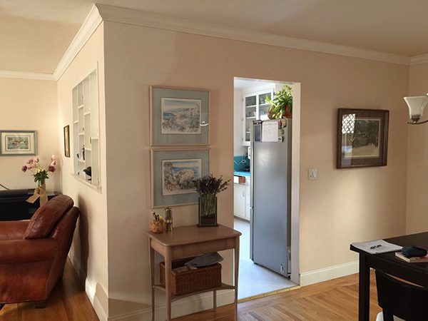
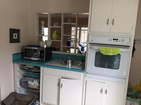
The original kitchen in this Menlo Park home only had the room for one cook at a time, as this inefficient layout lacked the proper space for even routine kitchen tasks. Having lived in this 1951 cottage home for more than 40 years, the client’s deep emotional connection to the original space proved to be a challenging part of the re-design process. She had previously hired multiple designers to freshen up the space, but never felt comfortable moving forward.
Creating An Open Space
The original 10’ x 11’ kitchen was a boxed-in space that did not interact with the adjacent dining and family rooms. The cramped layout did not provide the space needed for modern appliances or everyday work tasks in the kitchen. By eliminating the walls, the designer created an open concept kitchen designed for maximum interaction with the home’s social spaces.
Linear Layout
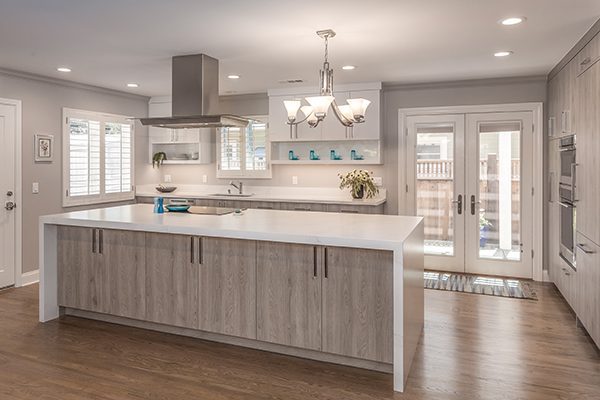
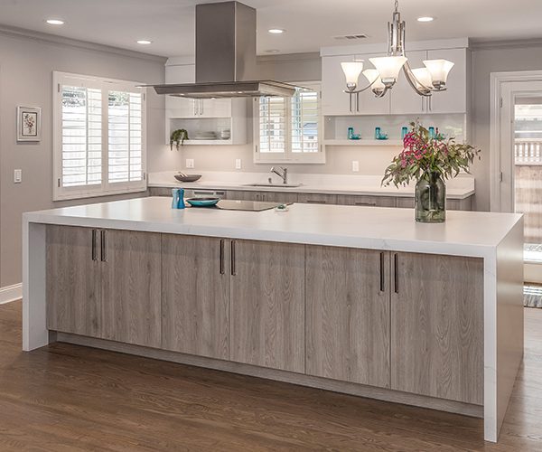
The client’s goals for this contemporary kitchen included a linear layout, anchored by a large island with maximum storage. A 20-foot flush beam—spanning the width of the kitchen—was installed to carry the load where there were once load-bearing walls. Although the new island was not designed to accommodate seating (to preserve space), the client requested a designated spot for her to be able to pull up a stool and “perch” at the island.
The Need for Custom Cabinetry
The old cabinetry was patched together over various home improvement projects to accommodate the shifting needs of the homeowner. The tired, 60-year-old plywood cabinets lacked any type of smart storage solution for this homeowner’s modern organizational needs.
Re-Organizing The Space
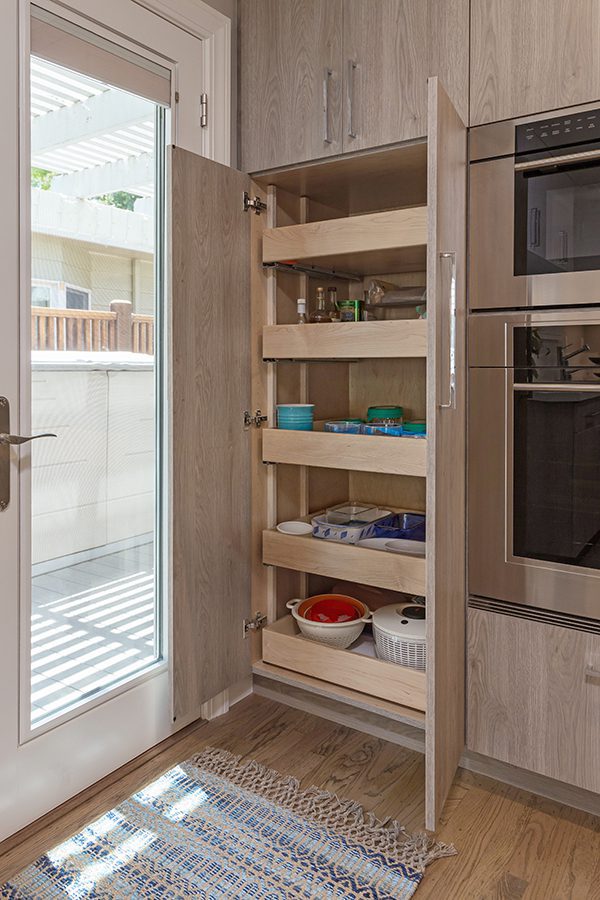
The client was thrilled with the idea of finally having cabinetry designed to her specific needs, as her own frustrations had led her to remove certain cabinet doors to increase accessibility. To prevent this from happening in the new, contemporary kitchen, careful thought was given to how each bank of cabinetry would be used, with preference given to drawers and pull-outs for easier access throughout the space.
The Materials
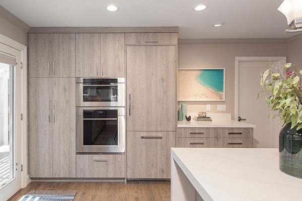
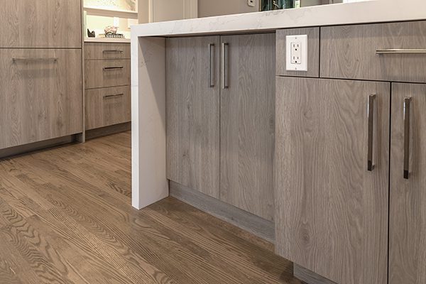
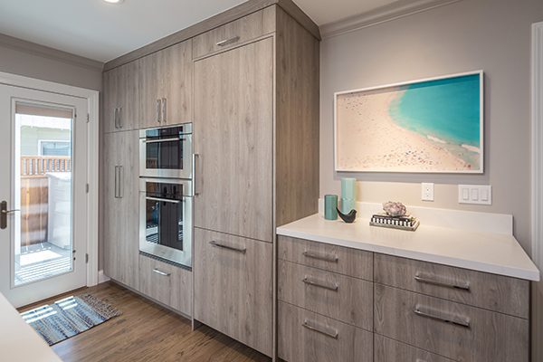
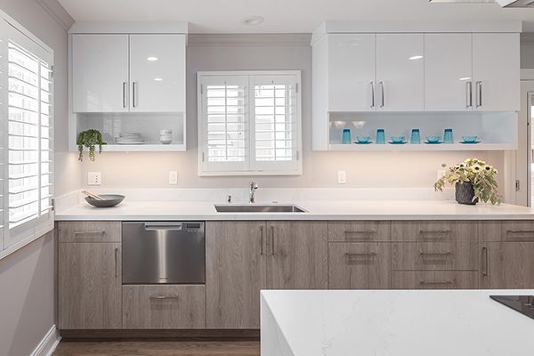
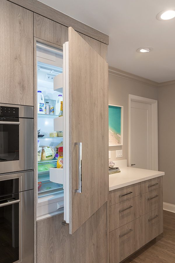
We communicated the euro-contemporary aesthetic with modern material selections such as cool gray laminate slab-front cabinetry and a 10-foot white quartz island with mitered waterfall edge. The island offered abundant space for a Wolf induction cooktop and hood, as well as plenty of surface area for landing zones and prep work.
